Introduction |
my first abstract photo shoot |
|
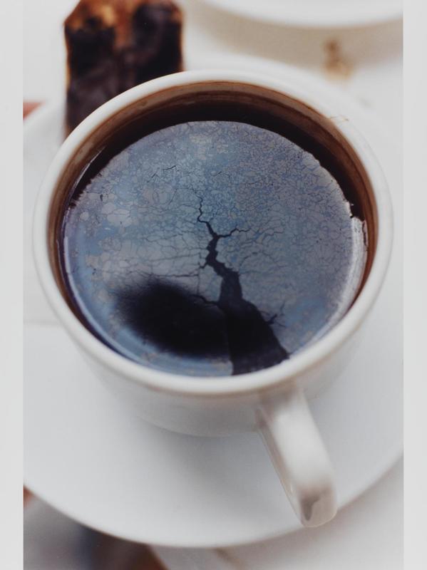
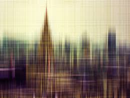
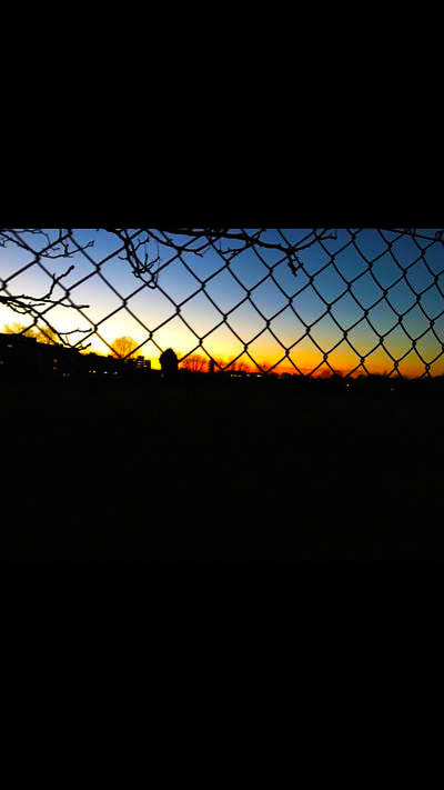
Abstract is something that is eye catching and
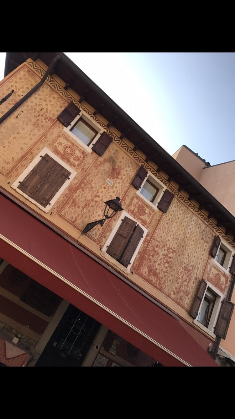
confusing. Abstract photos are normally confusing because the photo is taken so close that you cant really work out what is in the photo and if the photo has a subject within it you are normally more drawn to what is around the subject. Most abstract images only have still life things in it as it is a representation of life rather then real life.However all photos can be argued to be abstract photos. 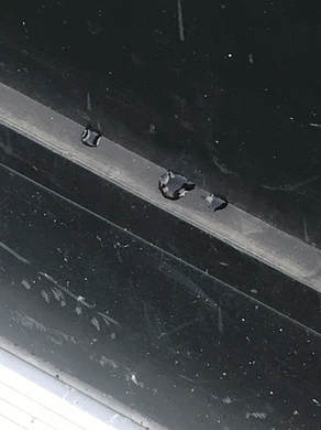
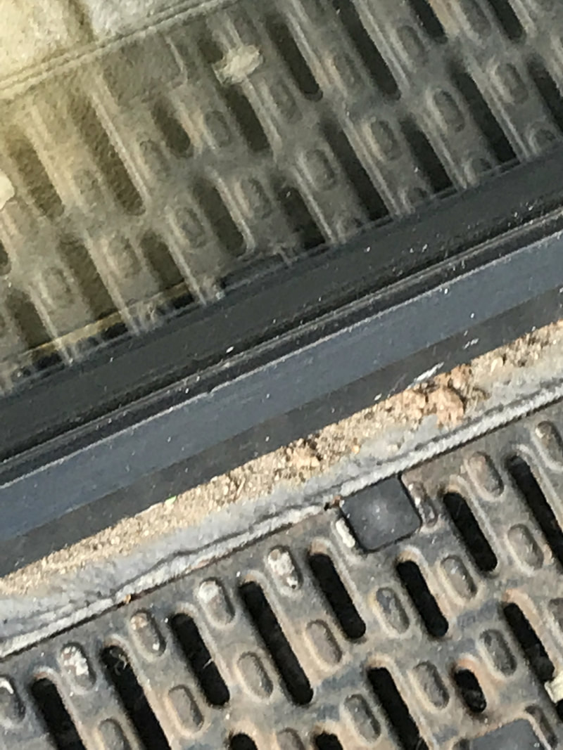
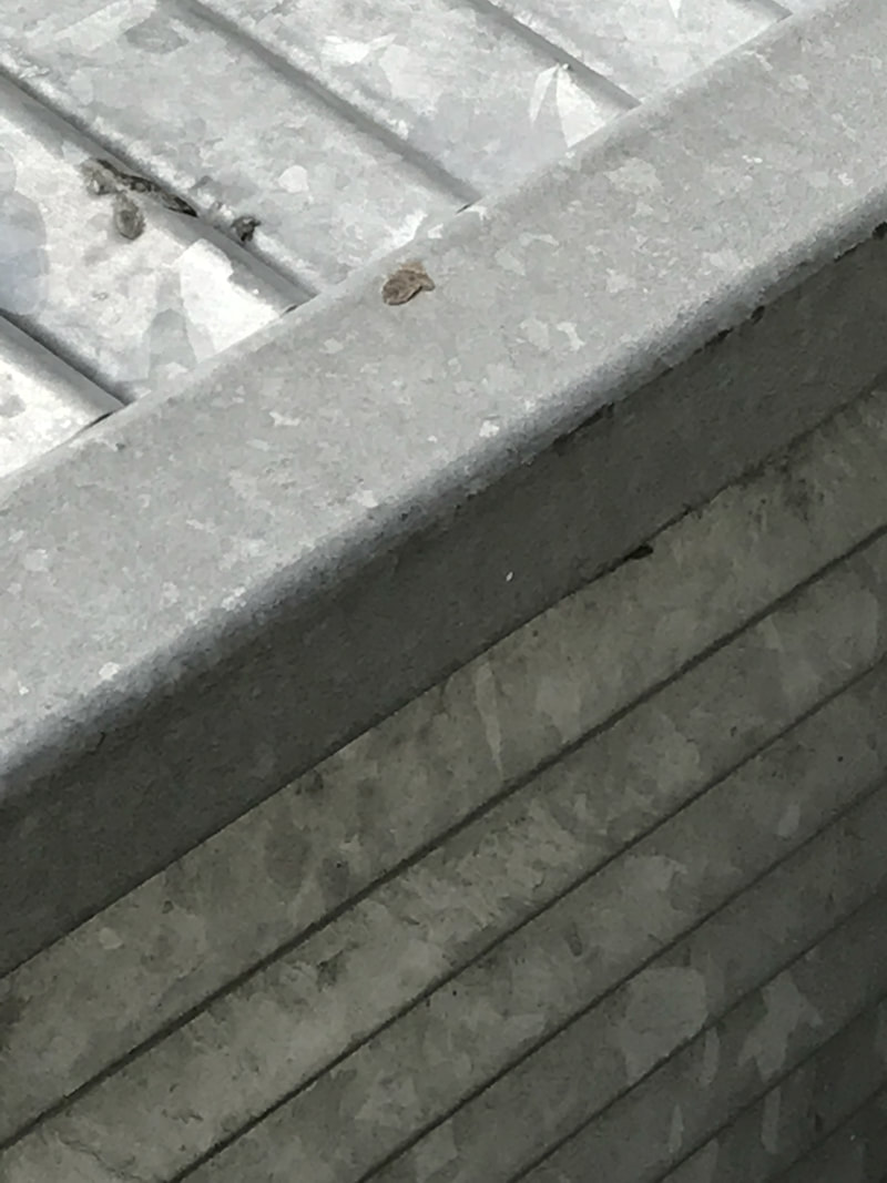
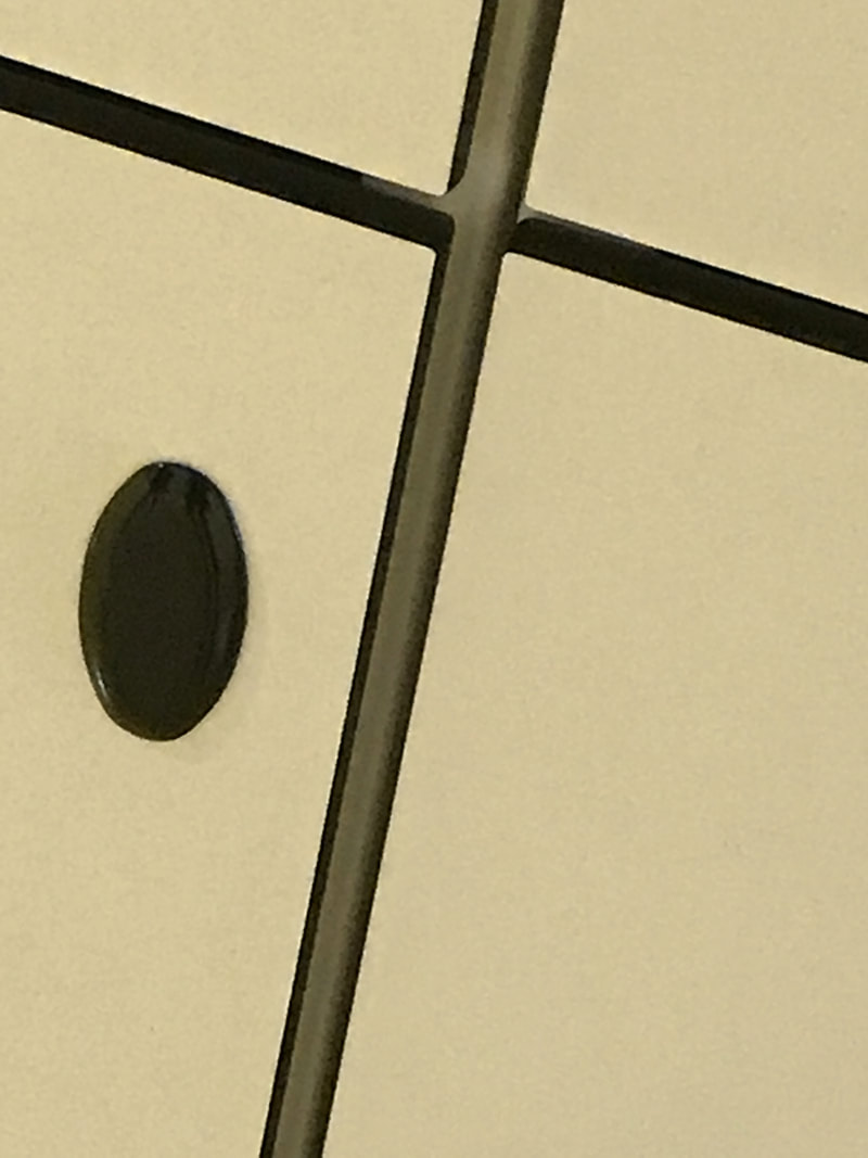
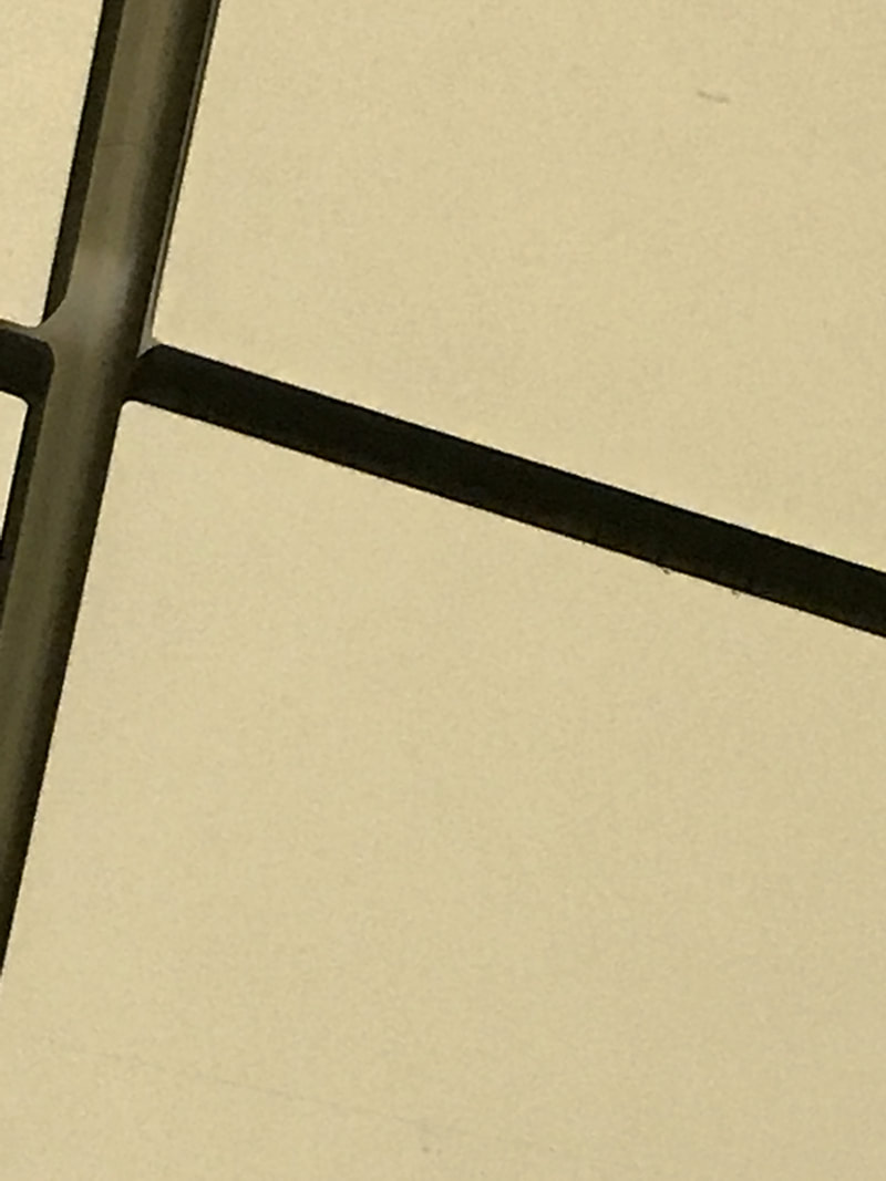
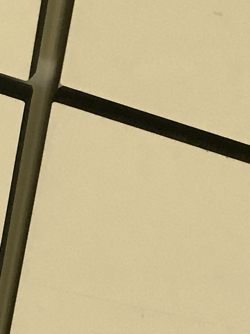
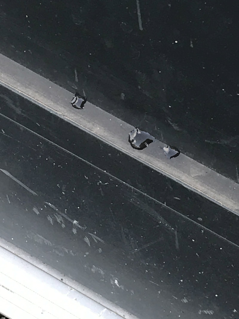
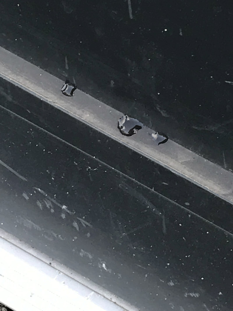
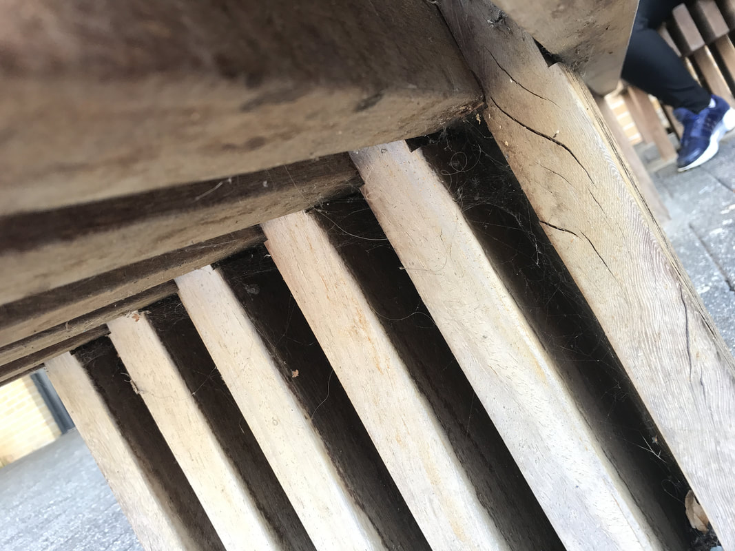
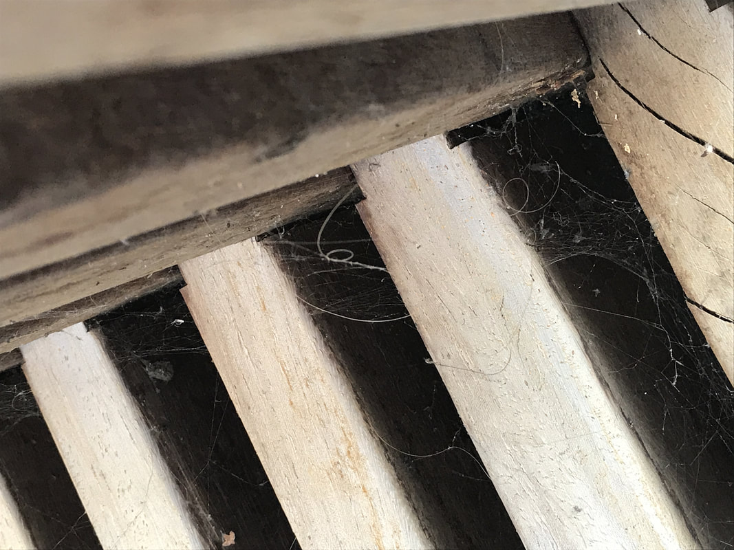
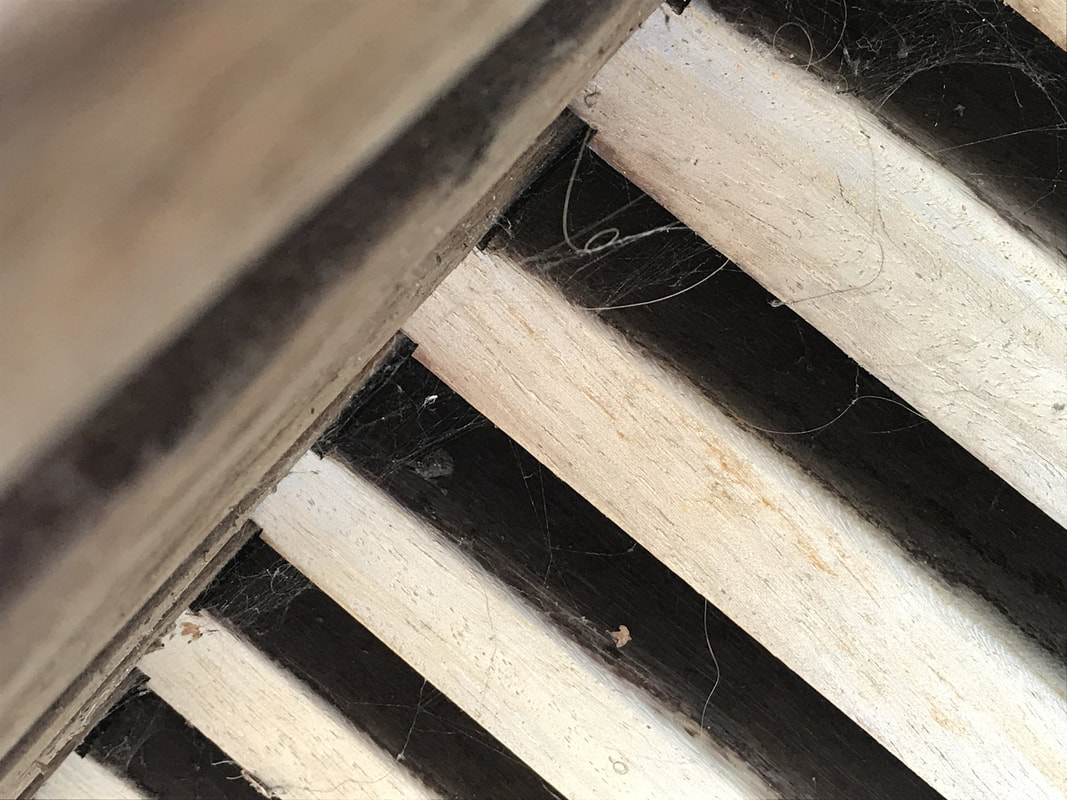
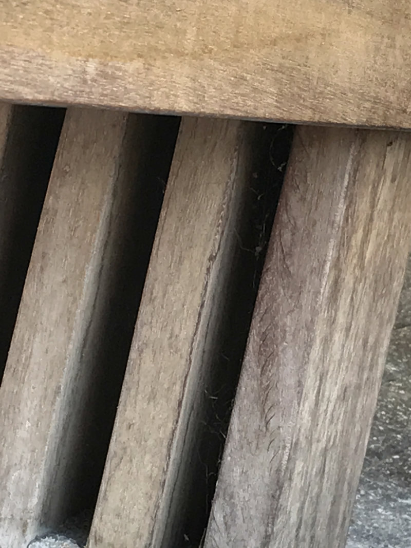
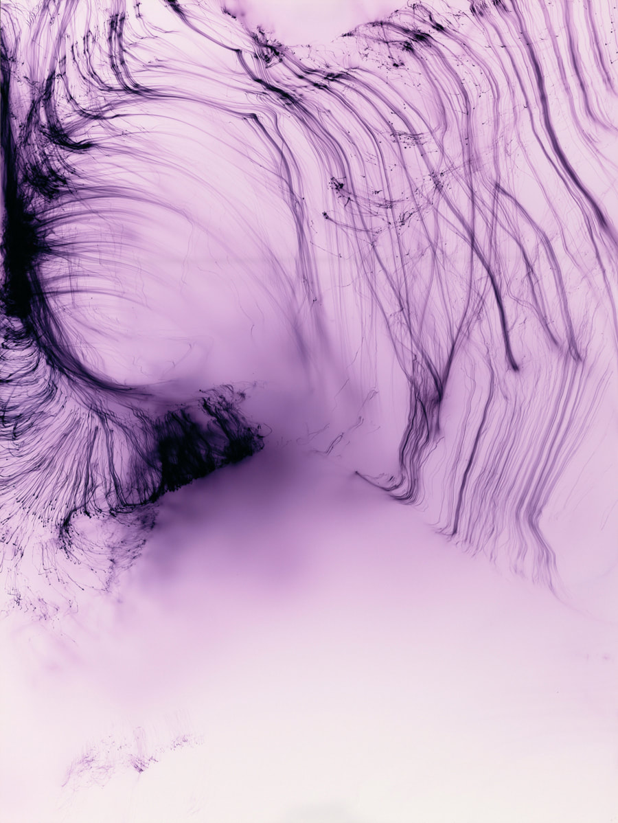
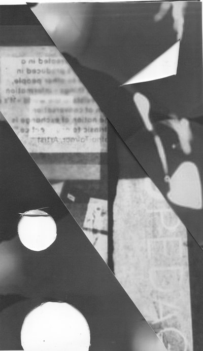
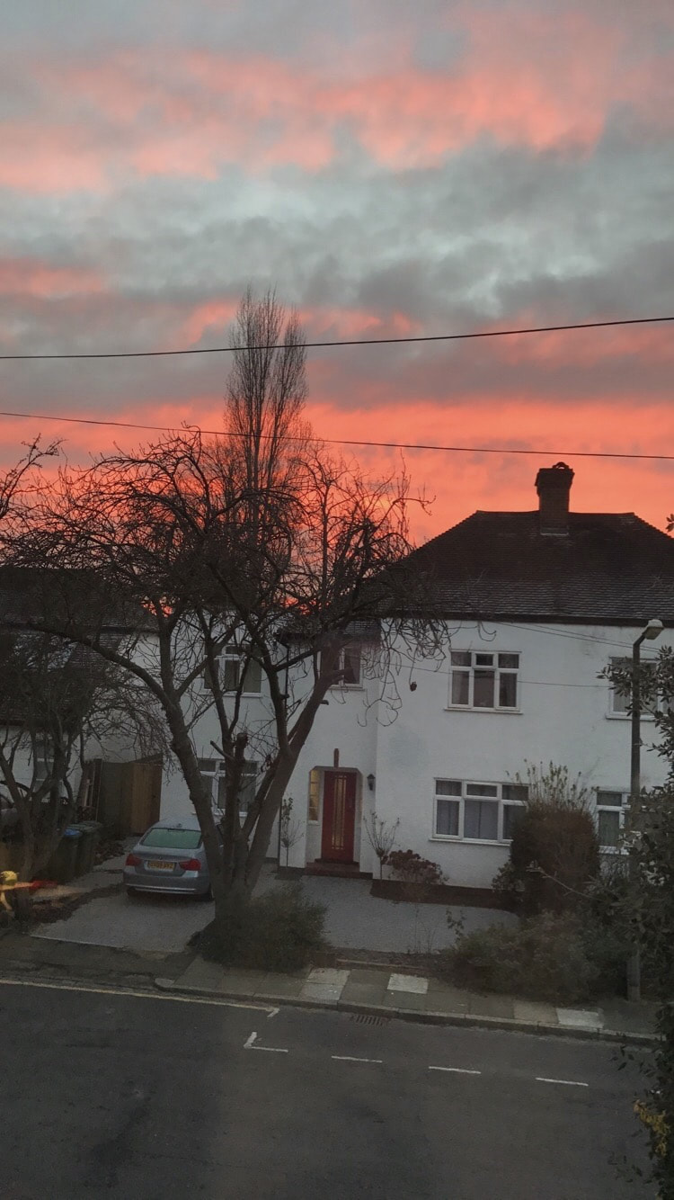
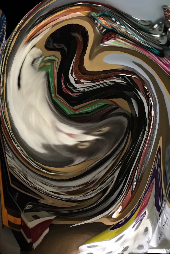
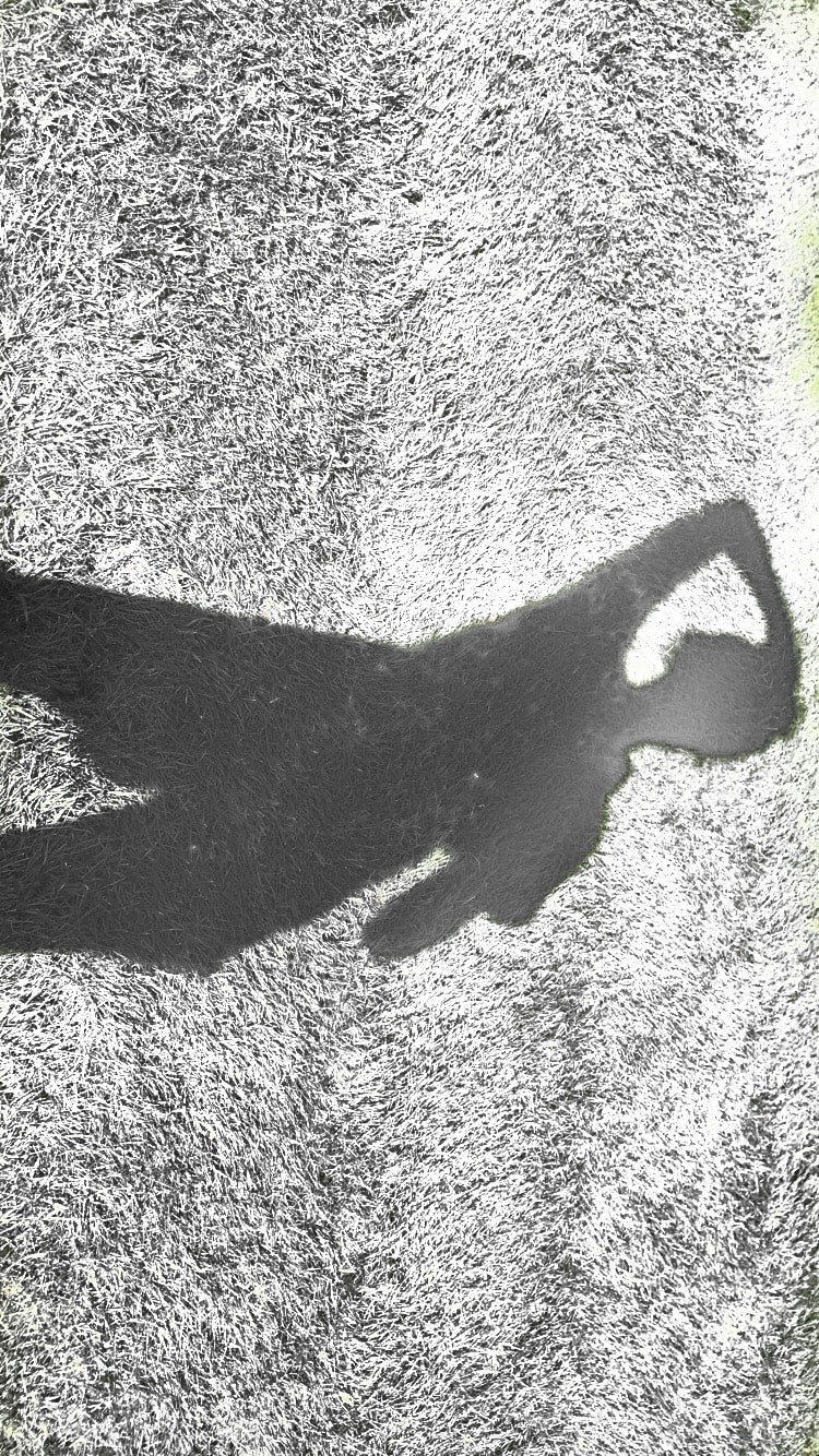
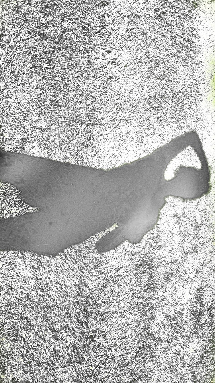
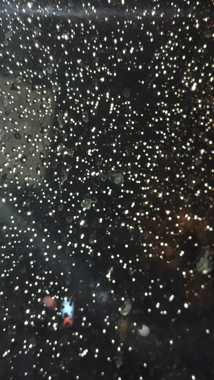
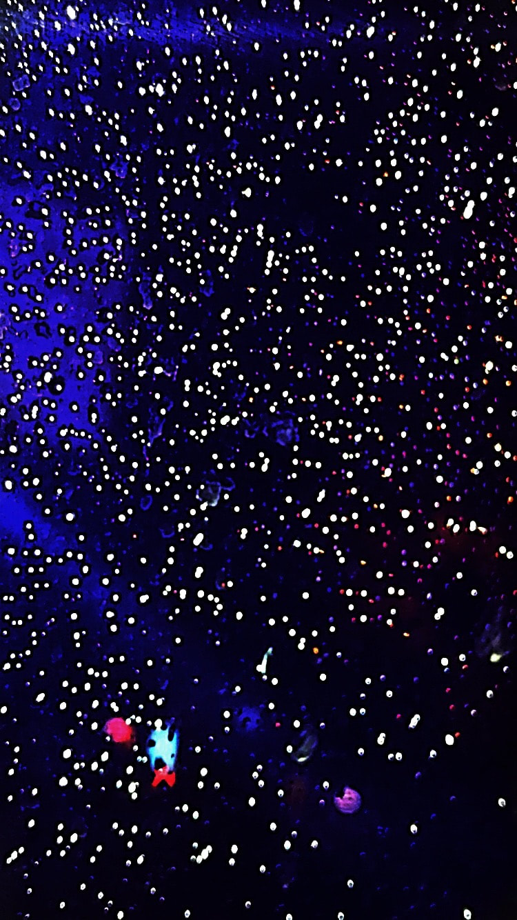
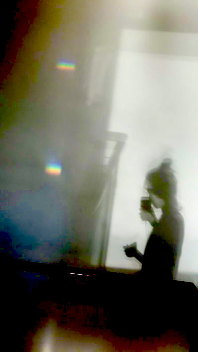
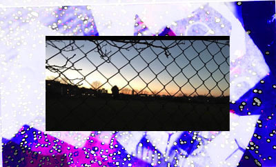
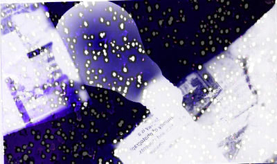
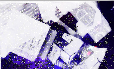
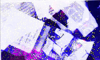
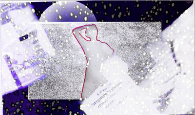
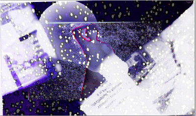
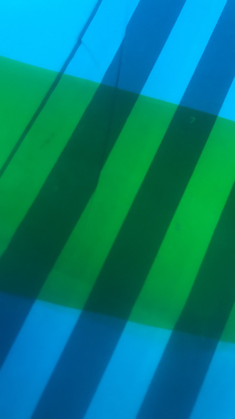
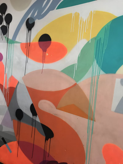
This is my favourite photo from my first abstract photo shoot because I think it looks the the most unrecognisable and the most interesting. This is a photo of a windowsill but because I took it up quite close I don't think it looks much like a windowsill which I like because it makes people look at it in more depth. I also really like the fact that the photo kind of has a main subject in it, when I first look at the photo I'm drawn to the rain drops in it and then after all the white marks throughout the photo. I personally like when photos have a main subject within it because it makes me think more about where the photo could have been taken and you can use your imagination more.
|
|

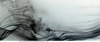
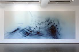
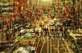
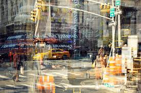
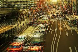
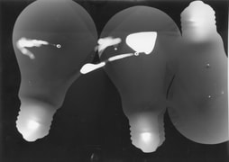
edward steichen
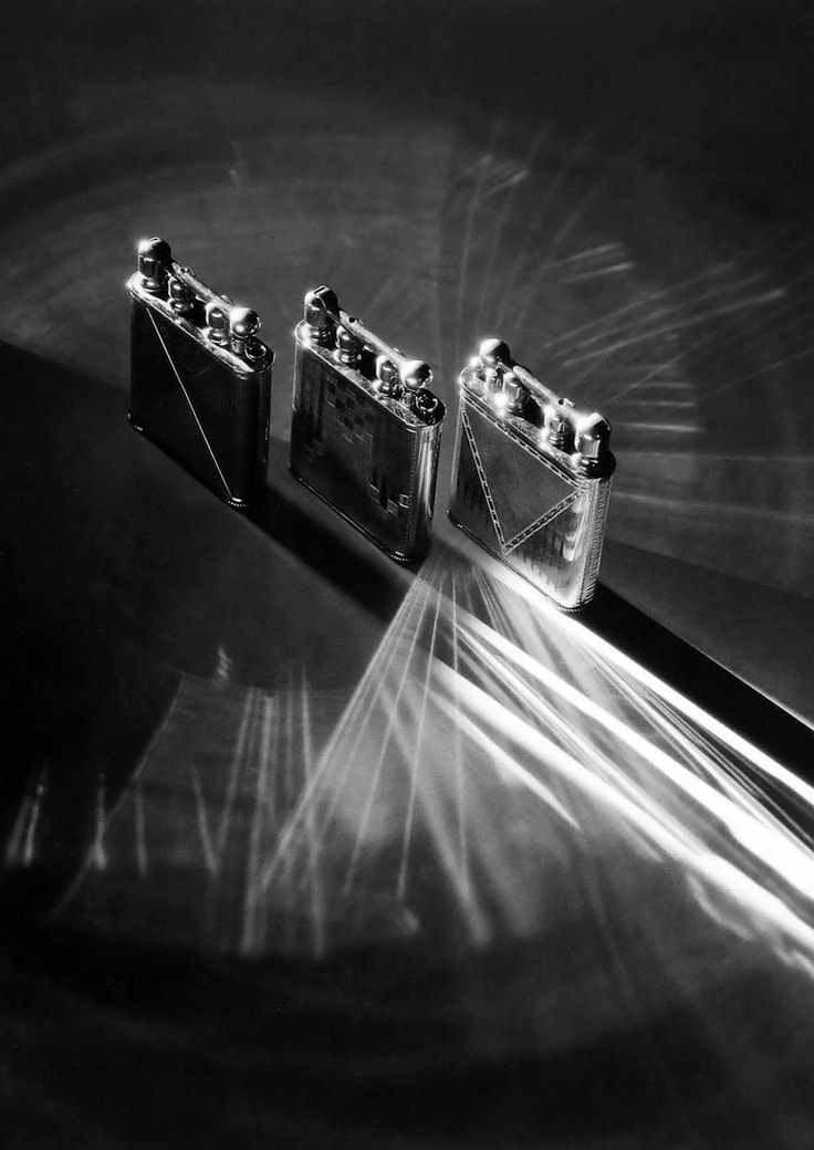
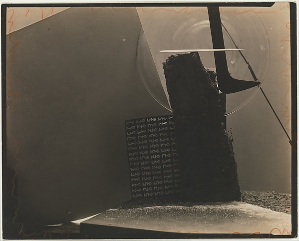
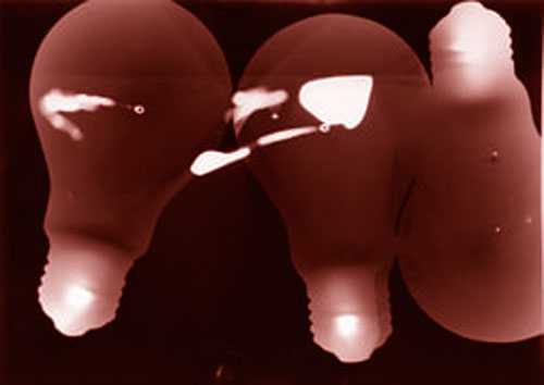
The first photographer I researched was Edward Steichen,Edward Steichen is a american photographer and painter, He was born on 27 March 1879 and died 25 March 1973. I was surprised when I saw his birth date because his photos look quite high quality which you wouldn't expect from that time period. I saw one of his photos in a book called the edge of vision. The photo I saw was called Time-Space which is the middle photo above. I was really interested in the photo because at first you can't really tell what everything is in the photo and you can tell the the things in the photo weren't found in the arrangement naturally. I then started thinking why the photographer would have put the objects in that arrangement and how long he thought about it for. After seeing that photo I wanted to look at more of his work to see if all his photos were like this or if he experimented with lots of different things, after researching Edward Steichen I found that quite a lot of his photos are abstract and I found all of them really interesting as they are all really different.
wolfgang tillmans
Wolfgang Tillmans is a German photographer. He has had many exhibitions some being in gallery's as big as Tate modern. I find his work very interesting and I think I might use some of his work as inspiration for some pictures that I might make in the future. His work has also been used in some magazines showing many different people like his work. Like most other photographers he has also moved around a lot and he was based in London and new york for a bit as well. His work focuses on abstraction and in a lot of his photos he uses ink .I find these photos really interesting because you can use them within a lot of other images and they would also be really easy to edit in photoshop and add more colour to them. To make the ink photos Tillmans uses ink jets and laser printers. Most of his photos have one focus of colour within them and the rest are white I think he did this on purpose to emphasis the colour in the image.
branon woelfel
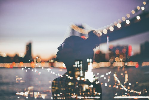
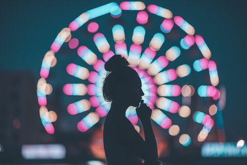
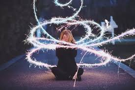
Brandon Woelfel is a New York based photographer born in long island. He studied computer graphics at the school of visual arts and started getting interested in photography in sophomore year of collage (15-16).Although he only got into photography when he was about 16 he has always been artistic taking multiple different art classes throughout his life. He was introduced to photography mainly through Instagram, He kept following different photographers on Instagram and became very inspired by their work. He started his own account where he posted regular photos he took and he quickly got a large following currently having over 1.6 million followers on Instagram and over a quarter million on twitter and he is only 23 years old. He has only been doing photography for about 5 years getting his first DSLR at 19 but his work has had a very positive outcome on people around him and people on social media. He now has a worldwide following and has already launched his first book Luminescence.
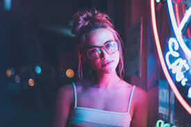
Brandon focuses his work mainly on light and colour and most of his photos also have a person in them. Most of his photos are quite abstract as they focus on the light and the surroundings in the photo more then the person. Brandon takes a lot of his photos at night as the black sky makes the light he uses in his photos stand out even more. As well as taking photos for his own Instagram and book he also does a lot of brand deals and a lot of photo shoots with various different Youtubers and Instagram celebrity's, his style is quite vintage and even when he does brand deals or shoots with other people he still brings in his style to the photo. Brandon has been drawn to lighting within pictures for quite a long time and it started at Christmas as there were lots of lights around and since then he hasn't really stopped photographing with light. In a lot of his photos he also uses couples in them or his friends as he says it adds a more personal touch to the photo and he also says that when he does shoots with people he normally becomes friends with them after and normally does more shoots with them after. Brandon edits most of his photos using photoshop or light room to enhance the lights and colour in his photos although he does edit his pictures by turning contrast up and enhancing different colours he says that he doesn't like to pose the model in his photo because he wants to make his photos look as natural as possible and he doesn't want it to look like the photo was set up for the photo to be taken.
Brandon doesn't get his inspiration from one particular artist in particular but he get inspired by individual photos which he screenshot and puts into one album on his phone but most of the time he gets ideas for photos by himself. He shoots with a Nikon D750 and uses multiple different lenses depending on where and who he is photographing and how he wants it to look.
Stephanie jung
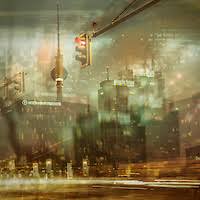
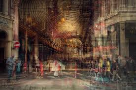
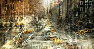
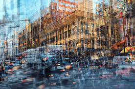
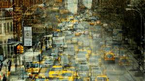
Stephane Jung is a freelance photographer based in Berlin, Germany. She found her passion for photography through her studies in visual communications which she finished in 2010. She has ben working as a freelance photographer since 2012 and her work focuses a lot on fine art and portrait photography, She likes travelling a lot as her work often uses cities in it as she likes capturing city life in her work, she also likes capturing the business of cities and the stressful life of them in her photographs. In a lot of her photos she also focuses quite a lot on contrast putting multiple photos on top of each other and it becomes kind of a pattern throughout her work. Her work has been published in a few different magazines and has also been exhibited in art galleries.
I personally really like her photos I think it is really interesting to look at her photos a finger out what the photos looked like originally and what belonged to what individual photos before she edited them all together to make a completely new image.
I personally really like her photos I think it is really interesting to look at her photos a finger out what the photos looked like originally and what belonged to what individual photos before she edited them all together to make a completely new image.
pablo picasso
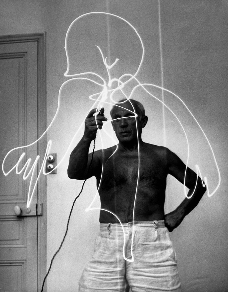
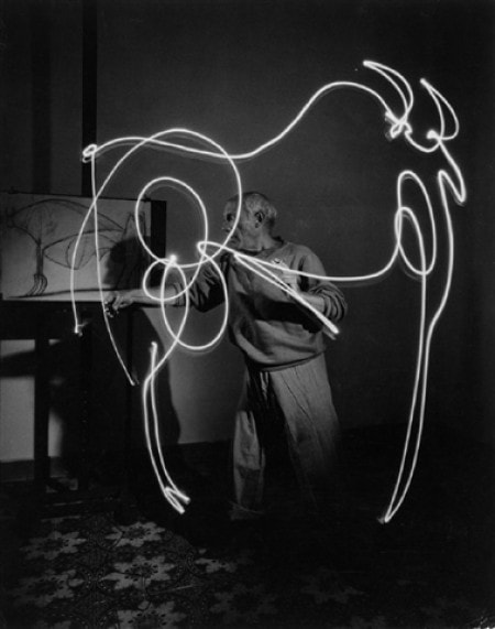
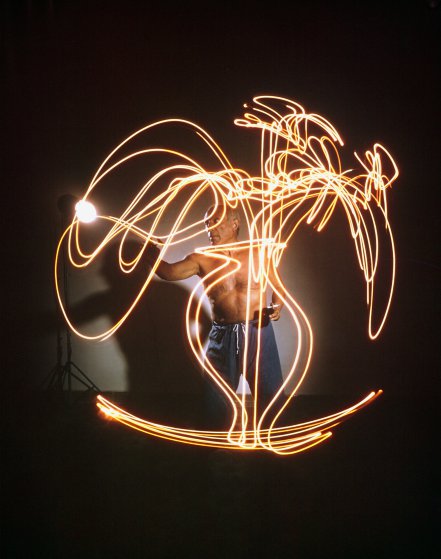
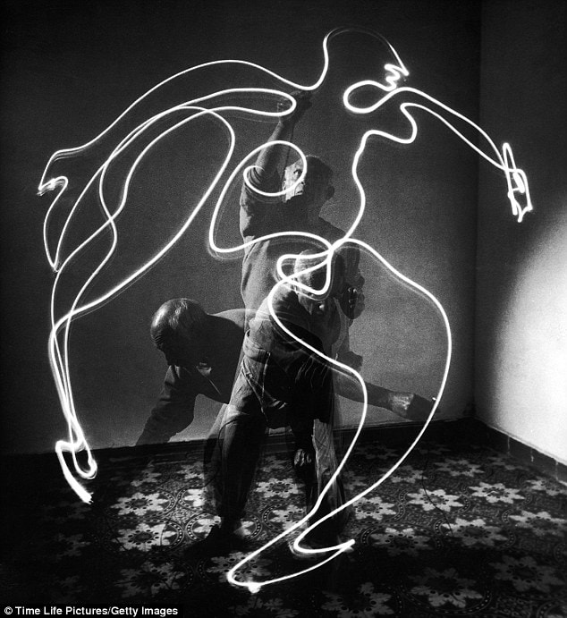


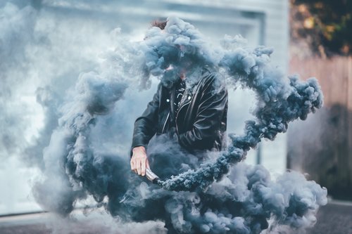
Pablo Picasso was a very famous artist known for many different paintings, drawings and sculptor etc, he was born on October 25,1881 and died on April 8, 1973.One of the most famous series of drawings Picasso did are his line drawings, where he would create a drawing of something without taking his pencil of his paper. Picasso was asked recreate his line drawings using air as his canvas and he agreed to do a experiment of it for a quarter of a hour and fell in love with it and did a further five sessions of using air as his canvas and light as his pencil. His photos were exhibited in 1950 in New York Cities museum of modern art ,the exhibition showed the process and the final outcome of his photo experiment and captured a lot of people.
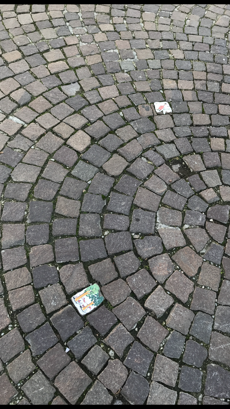
Dark room abstraction
|
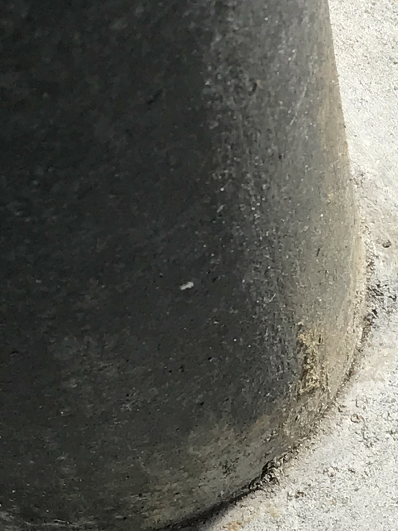
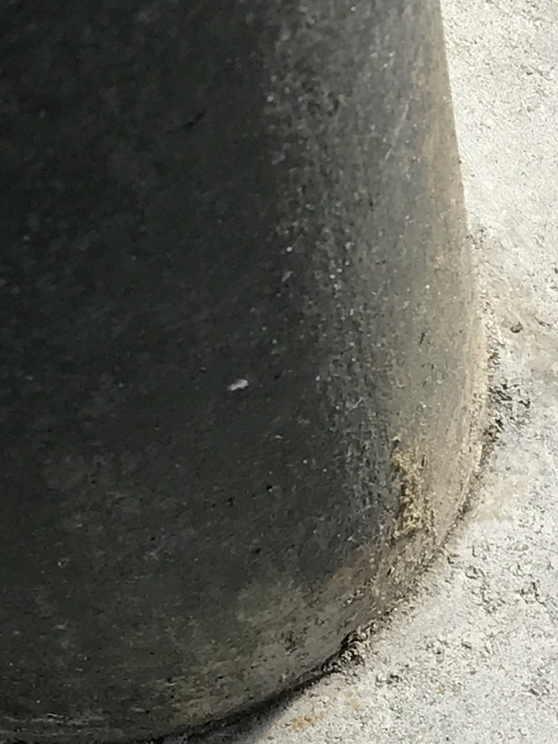
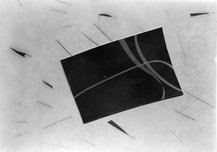
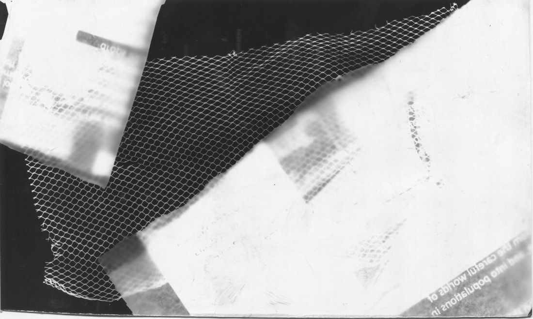
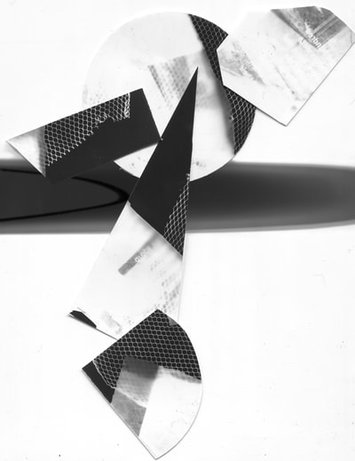
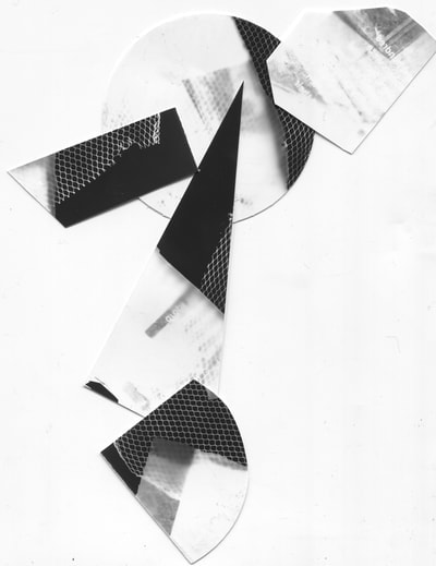
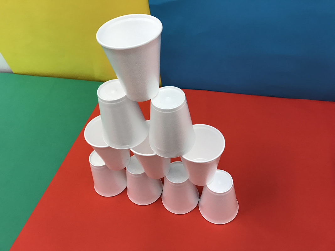
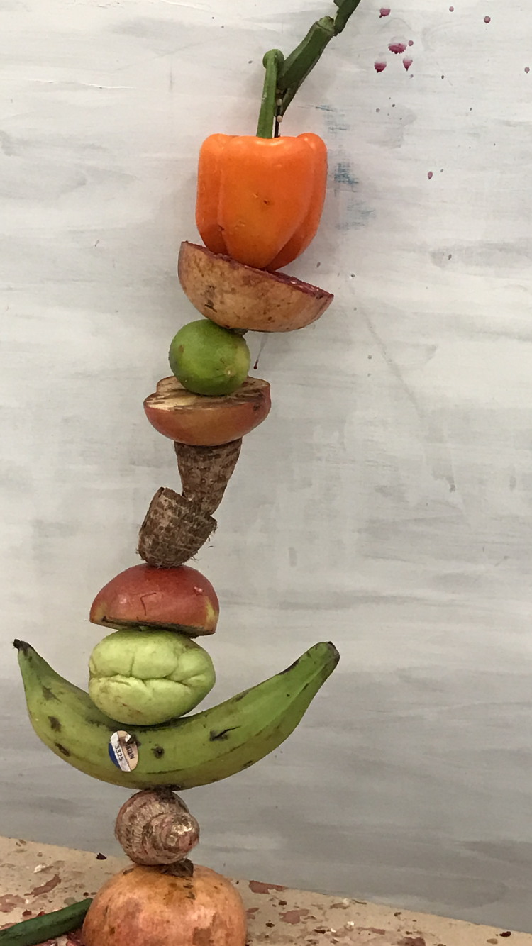
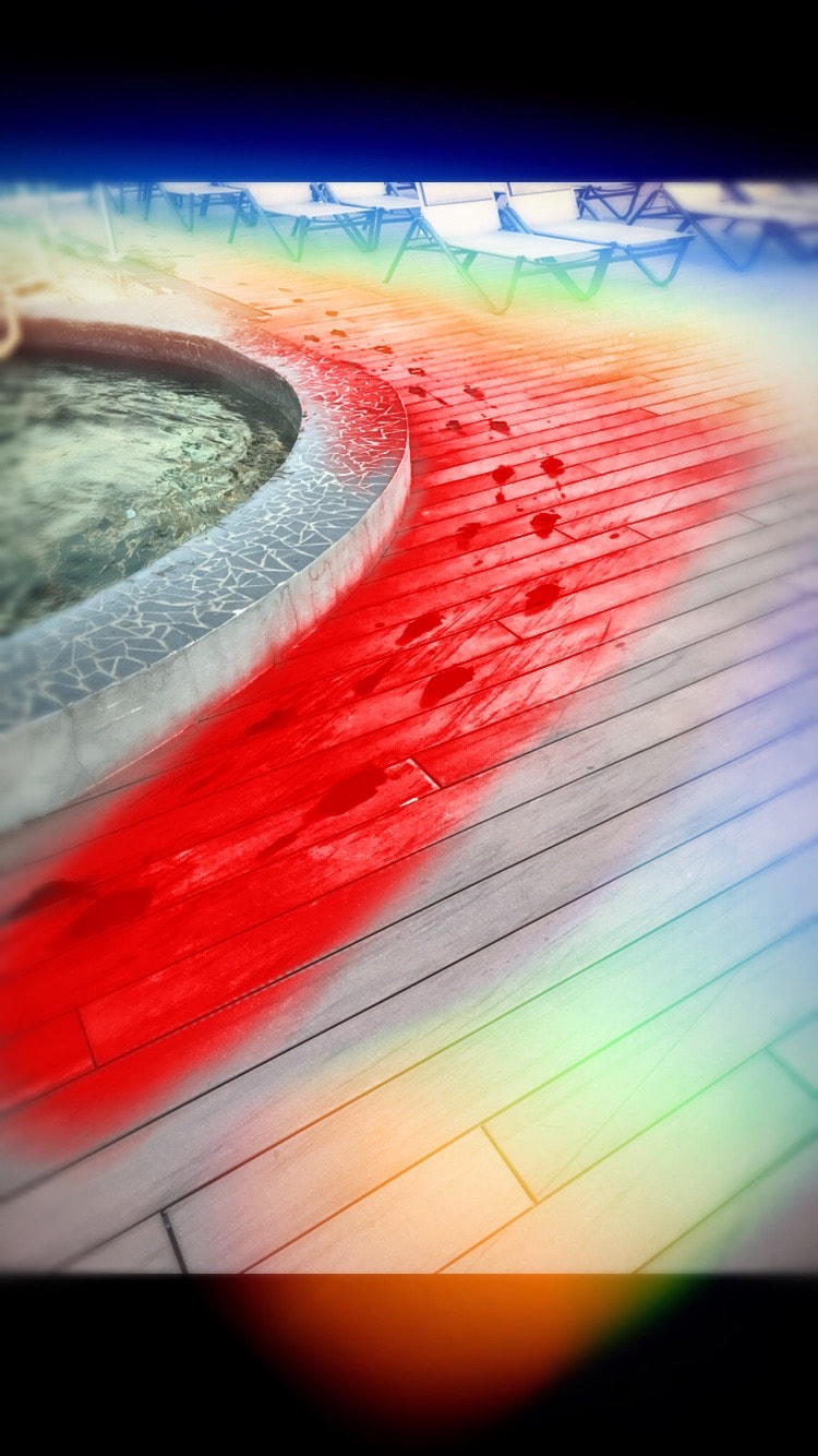
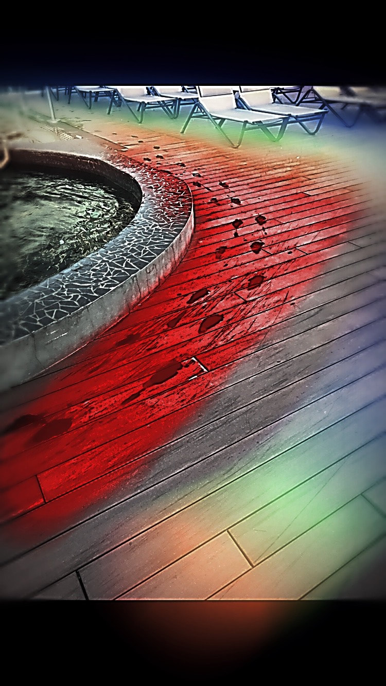
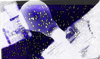
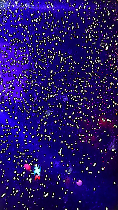
I wanted to experiment more with abstraction more so I went in the dark room and tried to make some abstract photos.
The photo on the left is my favourite photo I made in the dark room, I like it because there isn't really a subject in the photo and I can use it within other photo to make them look more intresting. I made this photo by cutting lines in a A3 piece of paper and putting it over a piece of photo paper in the dark room, I then exposed it to light for about 5 seconds and then developed it with the chemicals. I really like the outcome as it is really simple but I still find it really interesting and you can also use it within a lot of other photos. I also really like the photo on the top right as it has some weird patches of light on top of it, I think this could be because I didn't leave it in the chemicals to fully develop but I think I prefer the outcome more then if I was to let it fully develop. |
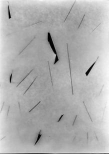
photograms


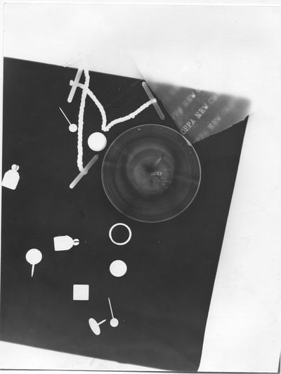
These are some photograms that I made in the dark room I like some of them but I think they could all look better if I edited them and played around with the layout of them. I made these photograms by putting newspaper over photo paper in the dark room and exposing it to light for about 1-2 seconds. I think they would also look better if I edited some colour into them.
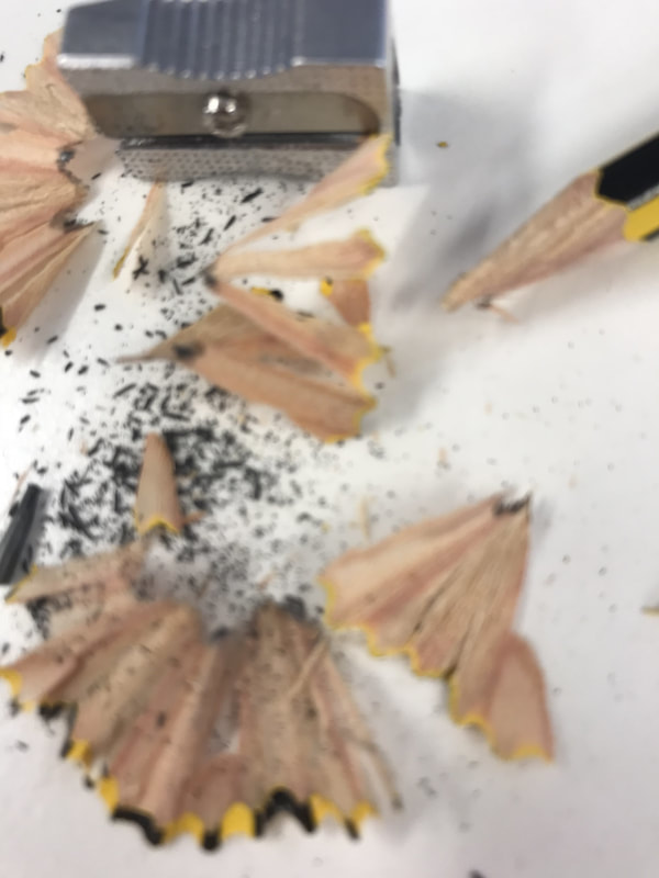
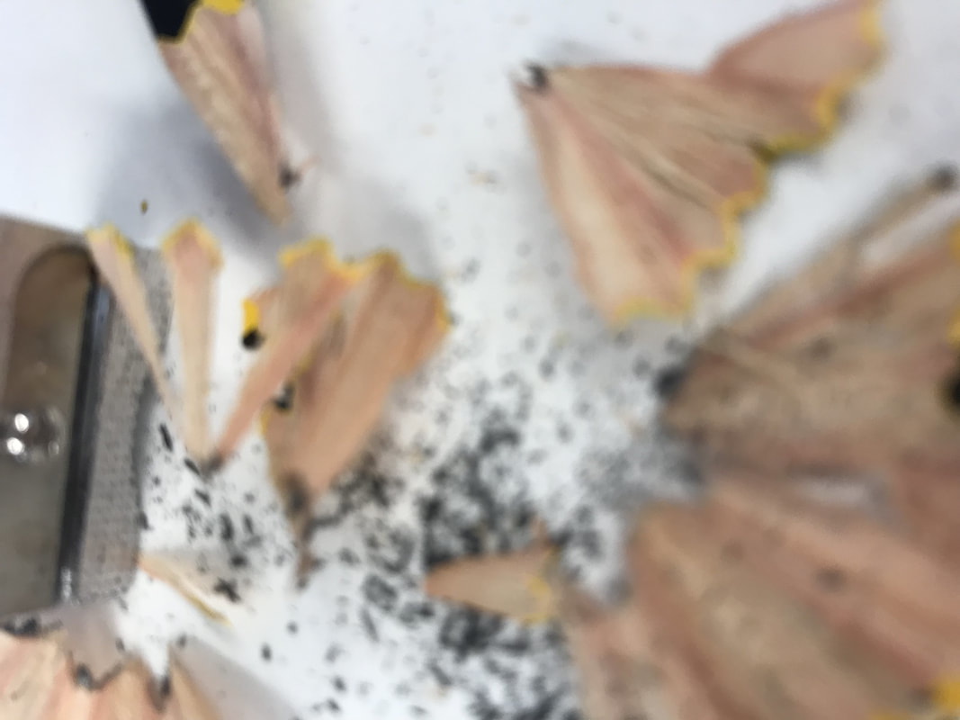
Abstract homework photos before editing


evaluation of homework photos
WWW- I think a lot of my photos are quite interesting in different ways and i also think a lot of my photos are quite easy to edited and enhance certain features of them to make them look even more interesting and eye-catching.
EBI- I think I could improve some of my photos if I took more photos of the same thing but using different angles and shots and if I took more photos shoots because then I would have lots of different photos to choose from of the same thing and I could reflect on what works best with different subjects within different photos.
EBI- I think I could improve some of my photos if I took more photos of the same thing but using different angles and shots and if I took more photos shoots because then I would have lots of different photos to choose from of the same thing and I could reflect on what works best with different subjects within different photos.
Abstract homework edited photos


|
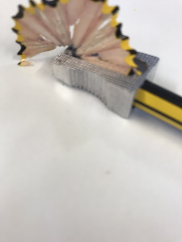
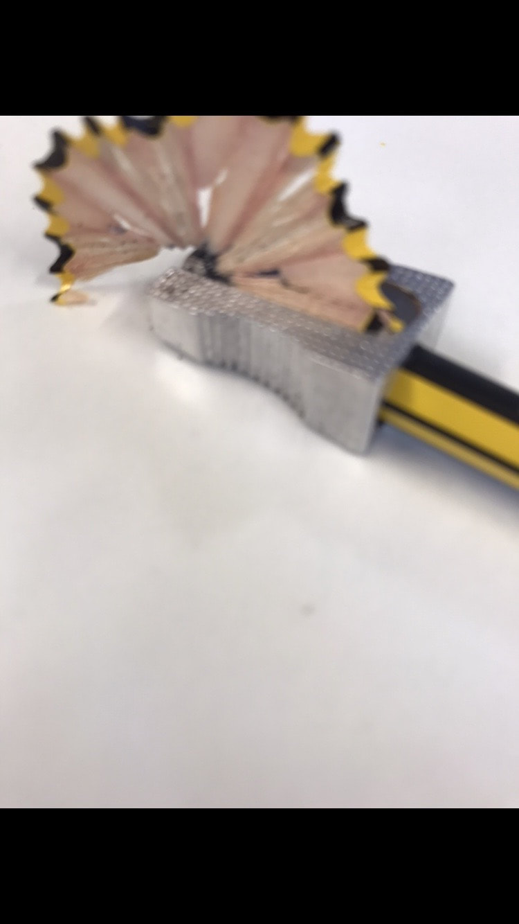
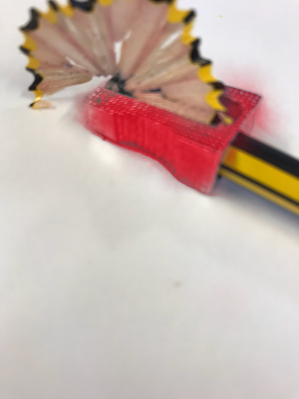
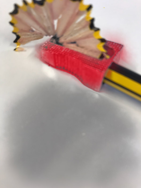
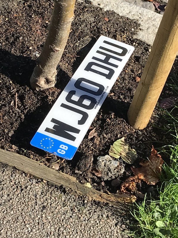
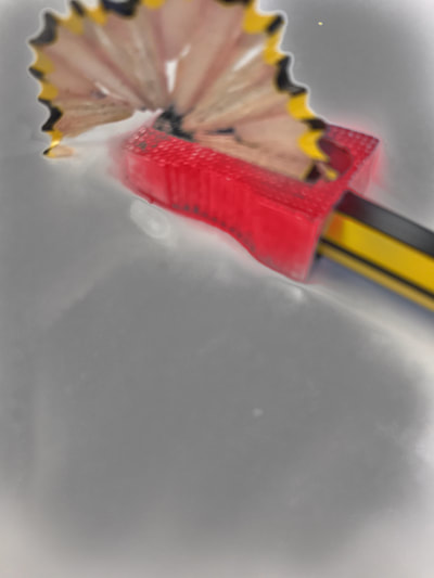
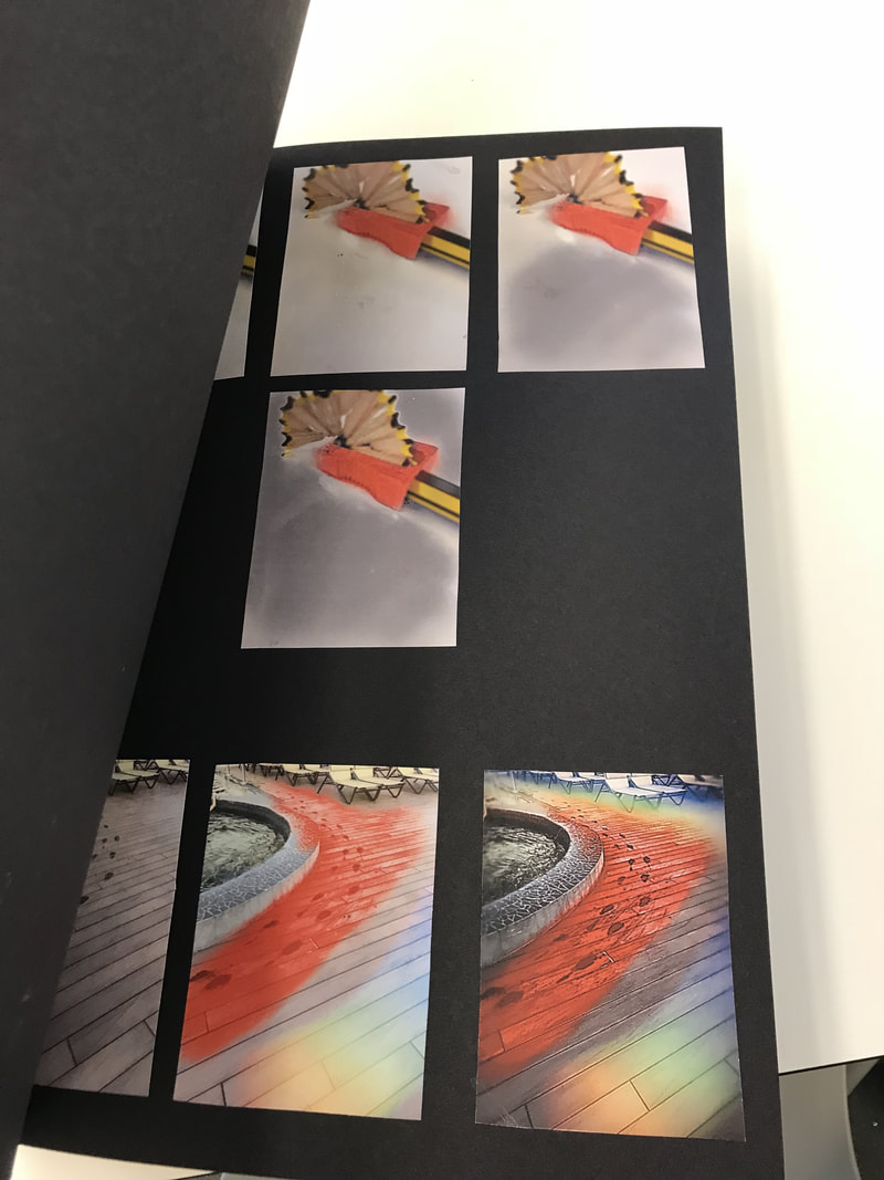
These are some of the photos that I edited. I edited them all so that they would have more colour in them and I also reshaped some of them and enhanced certain things in them such as the brightness and contrast. I edited the photos on a app called face tune on my phone. I really like how some of them turned out. I think my favourite photo is the car number plate thats red and before I reshaped it I also really like the last pencil sharpener photo because the sharpener really stands out. I think I am going to play around with more techniques on photo shop in class as photoshop has more things in it that I can use on my photos and the things on there have more detail in them and I think it makes the photo look more real.
|
|
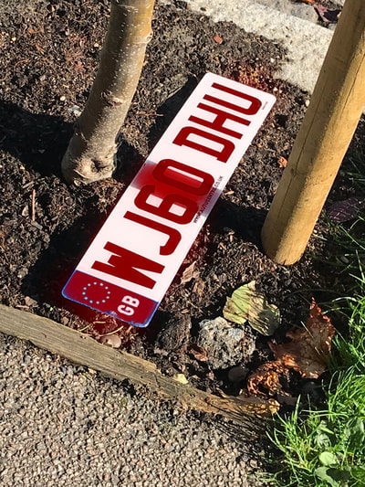
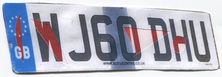
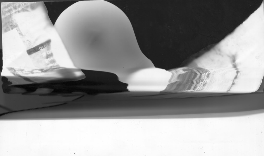
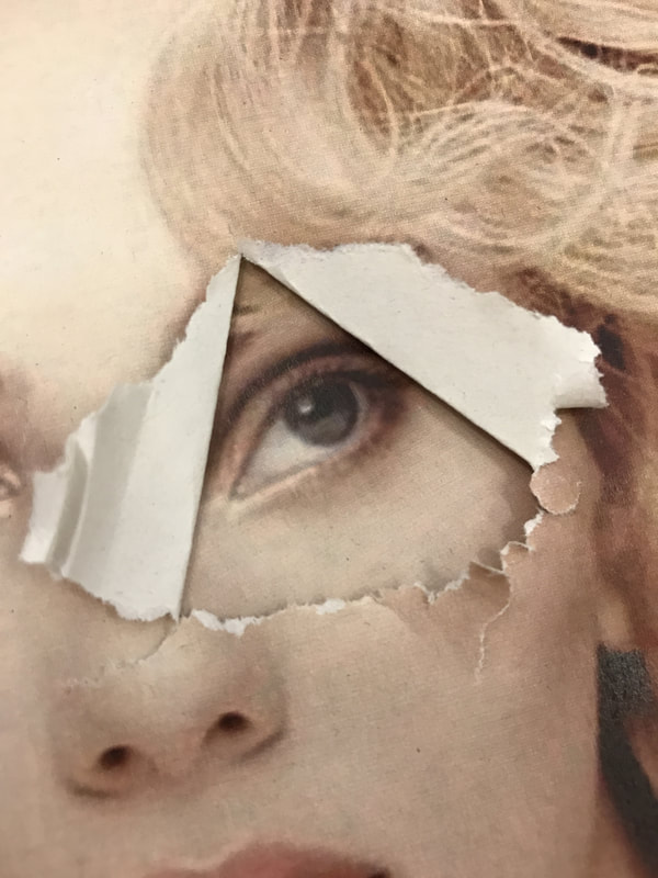
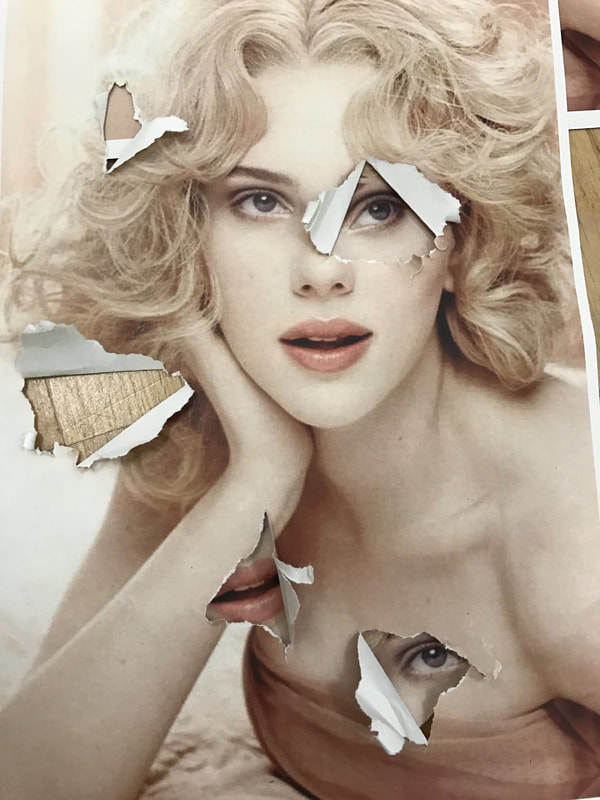
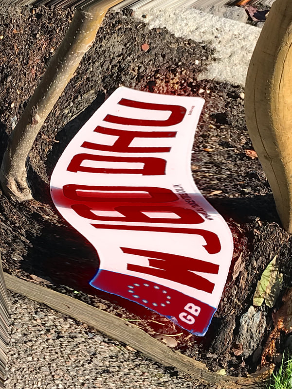
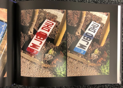
This is a photo that I decided to edit in real life, I used two photos and stuck them together. The photos were the original car number plate and the red one I edited, I decided to put them both together I did this by cutting random shapes in the original photos and then sticking it over the one I made red. I quite like how it turned out but I think it could look better if I edited it on photoshop as you can kind of see where I have cut it and if I edited it on photoshop you wouldn't be able to see that.
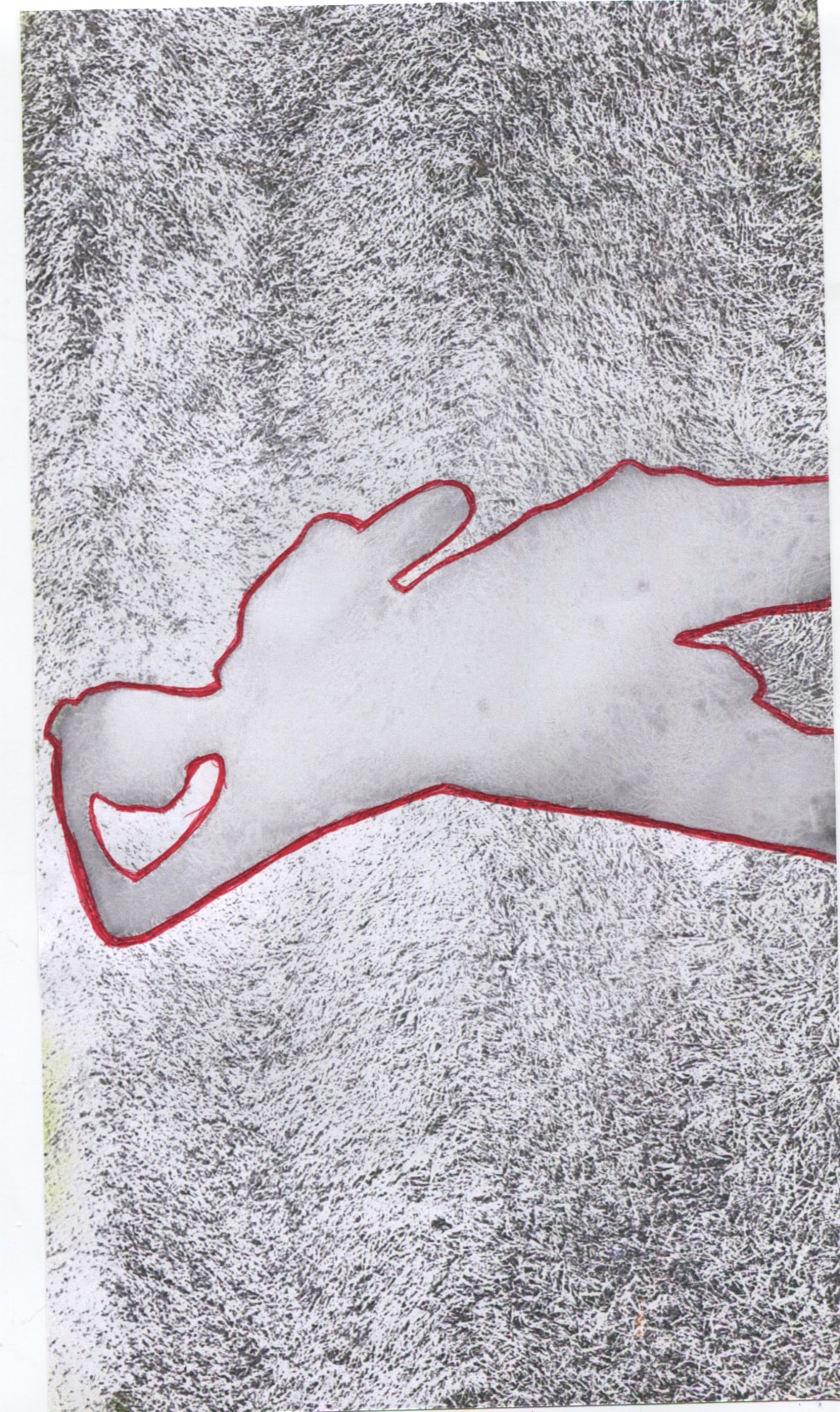
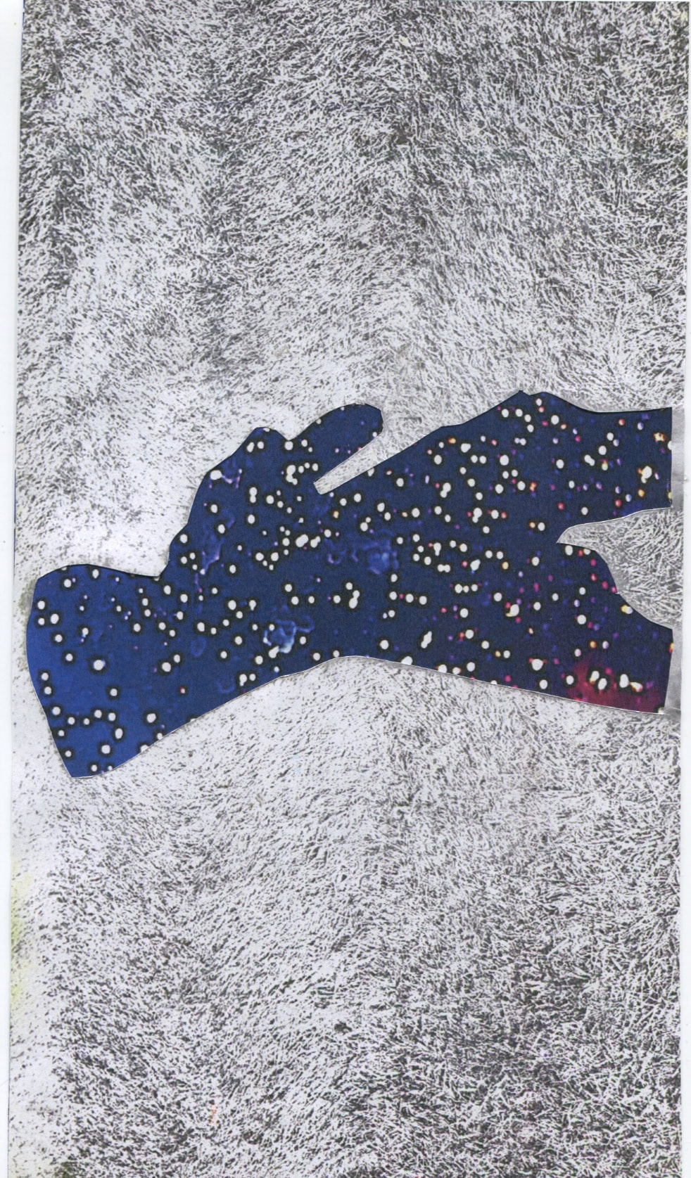
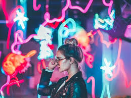
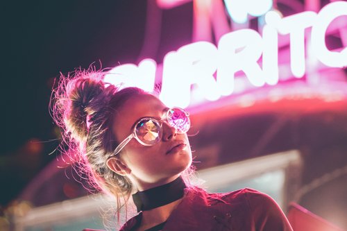
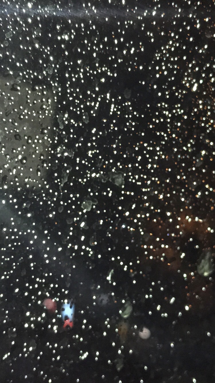
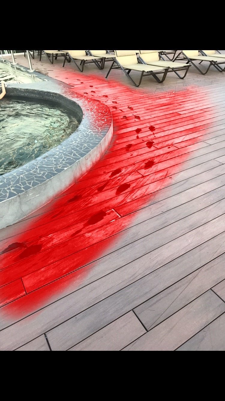
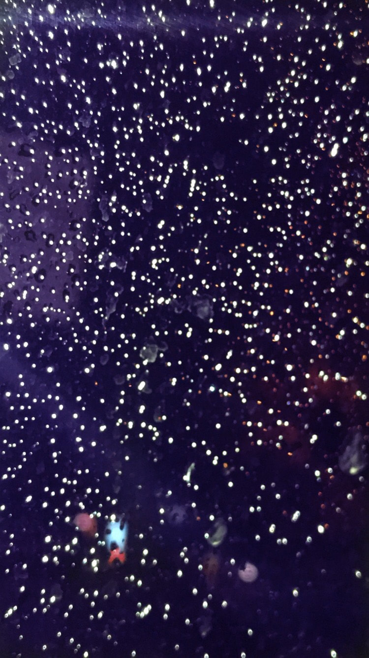
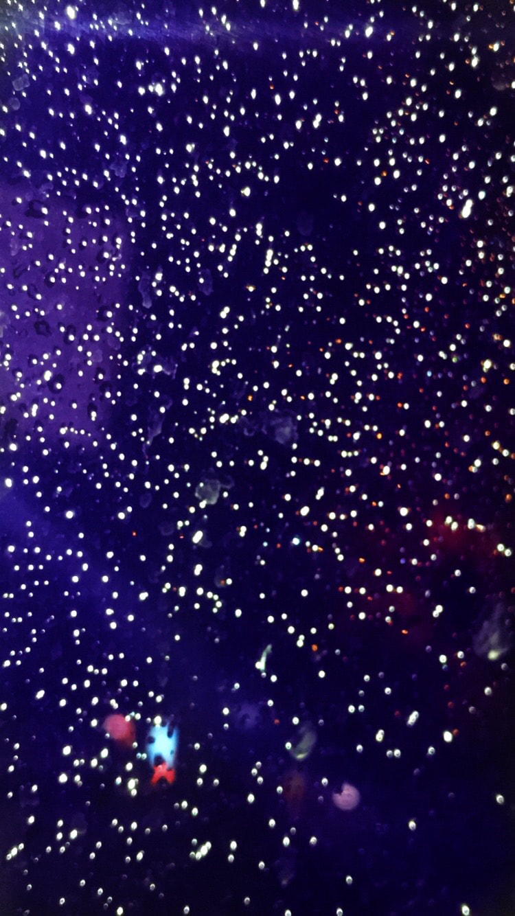
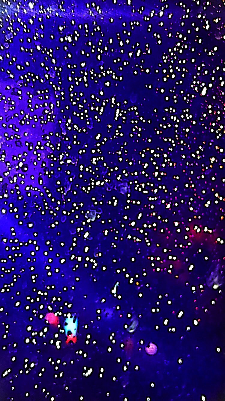
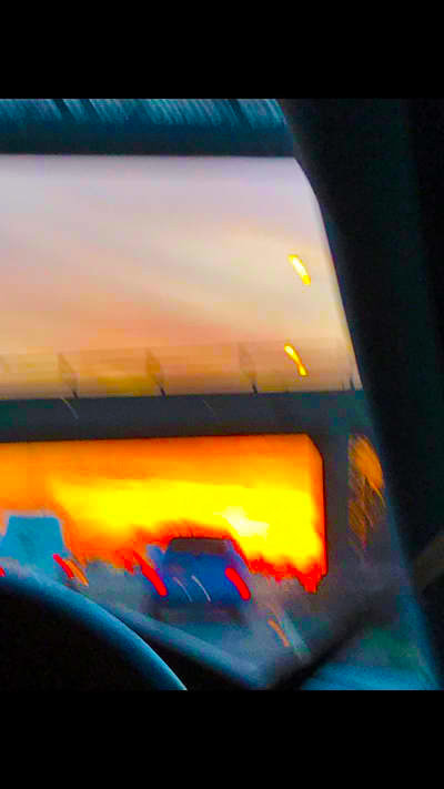
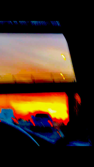
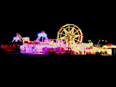
These photos are more photos that I decided to edit in real life. I got my inspiration for my photos from a instagram account I saw called brandonwoelfel .He played around a lot with lighting and they added fairy lights to a lot of his pictures. Originally the photo with blue lights in it was rain on a window but I played around with the contrast in the photos to enhance certain colours within the photo to make it look more interesting. I think the photo looks a lot better then the original picture and I really liked how it turned out. I also think these photo look better then the number plate one because I don't think it looks as obvious that I have edited it in real life.
duo tones
blended images


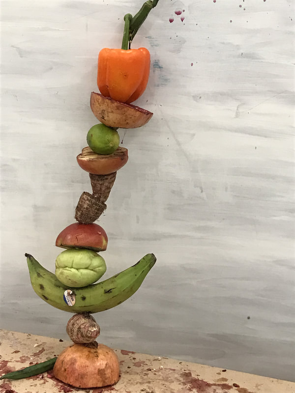
photoshoot
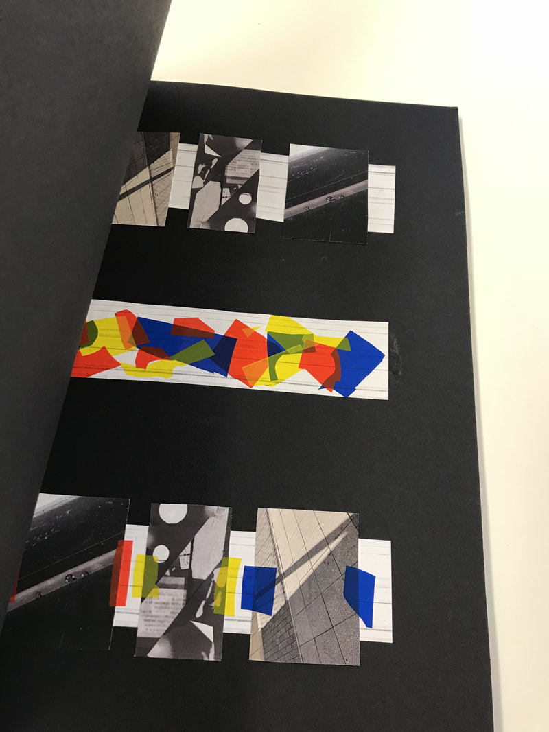
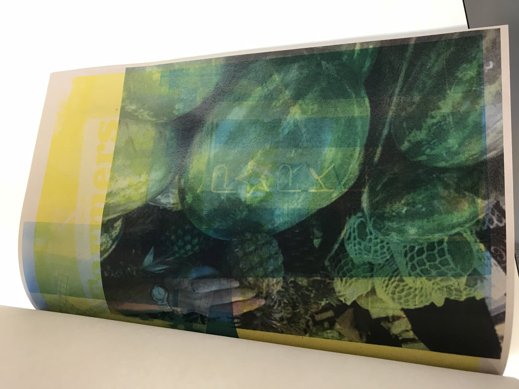
ABSTRACTION HOMEWORK (PHOTO BOOK)
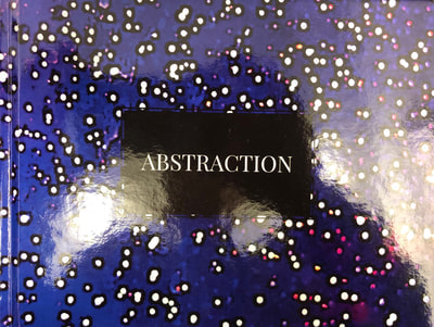
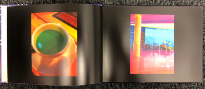
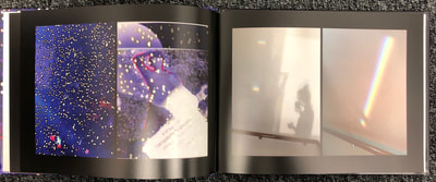
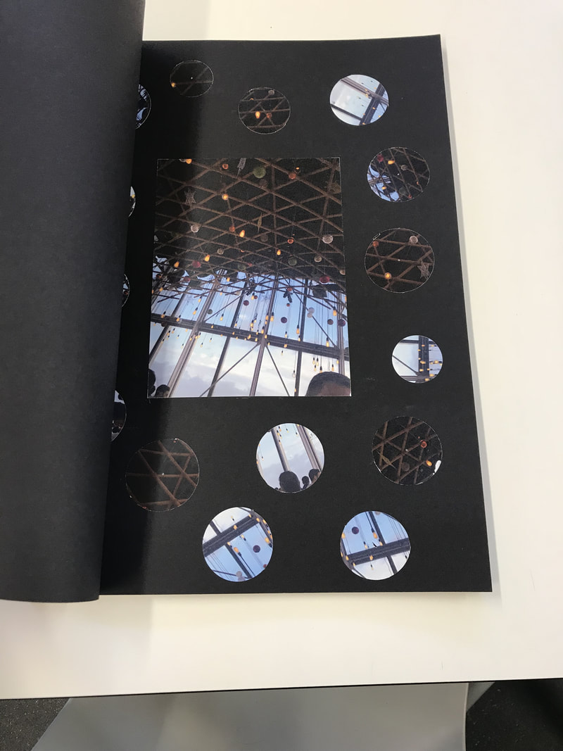
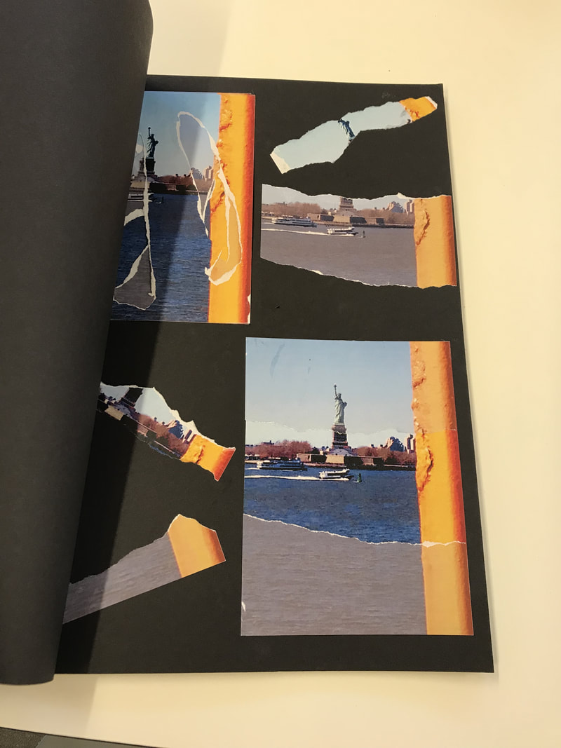
This was my book that I decided to make for my abstraction homework. I used a app called free photo book to get my book published to look professional as I hadn't tried this app before and I wanted to see if I liked the outcome of the book, I liked the app as it allowed you to change almost everything about the book choosing what style you want and allowing you to choose from a range of different colours so it felt really personal to you as you had chose everything in the book even though you didn't actually make the actual book yourself. I made the pages of my book to black as I think black makes photos stand out more than any other colours and thats what I wanted for my book. I also edited most of my photos on a editing app called face tune because I don't have access to photoshop at home and I also find the app face tune easier to use, I chose to edit some of my photos in my book because I also thought it would make them stand out more and as my main focus throughout the book was colour I thought enhancing the colour on some photos would fit with the theme more and I also thought it would make some photos look better then the originals. Some of the photos I edited on face tune didn't turn out as I expected and I didn't like some of the photos but I still saved them to my photos to remember what didn't work so well with some photos and so I could look back on all my work and my mistakes and evaluate what I learnt from it and what I would do in the future to make the final image look better.
Overall I quite like my final abstraction homework book as I have used a range of different images and used a few different editing techniques. However I do think that next time I could use more photos within the book and also maybe try editing it a bit in person like adding more photos over the top and cutting certain things out and putting other things in.
Overall I quite like my final abstraction homework book as I have used a range of different images and used a few different editing techniques. However I do think that next time I could use more photos within the book and also maybe try editing it a bit in person like adding more photos over the top and cutting certain things out and putting other things in.
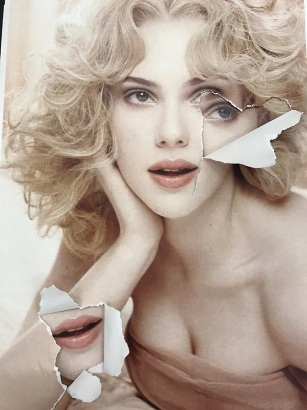
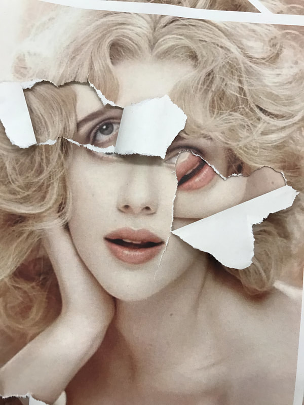
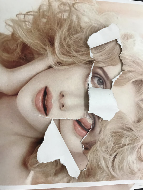
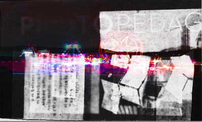
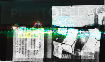
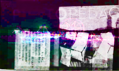
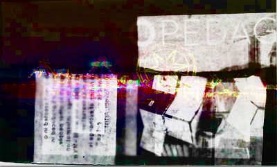
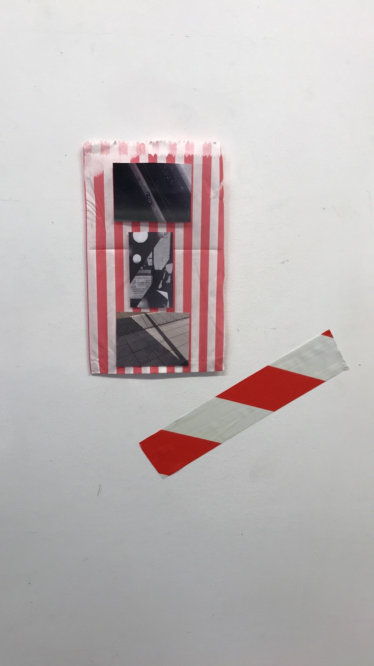
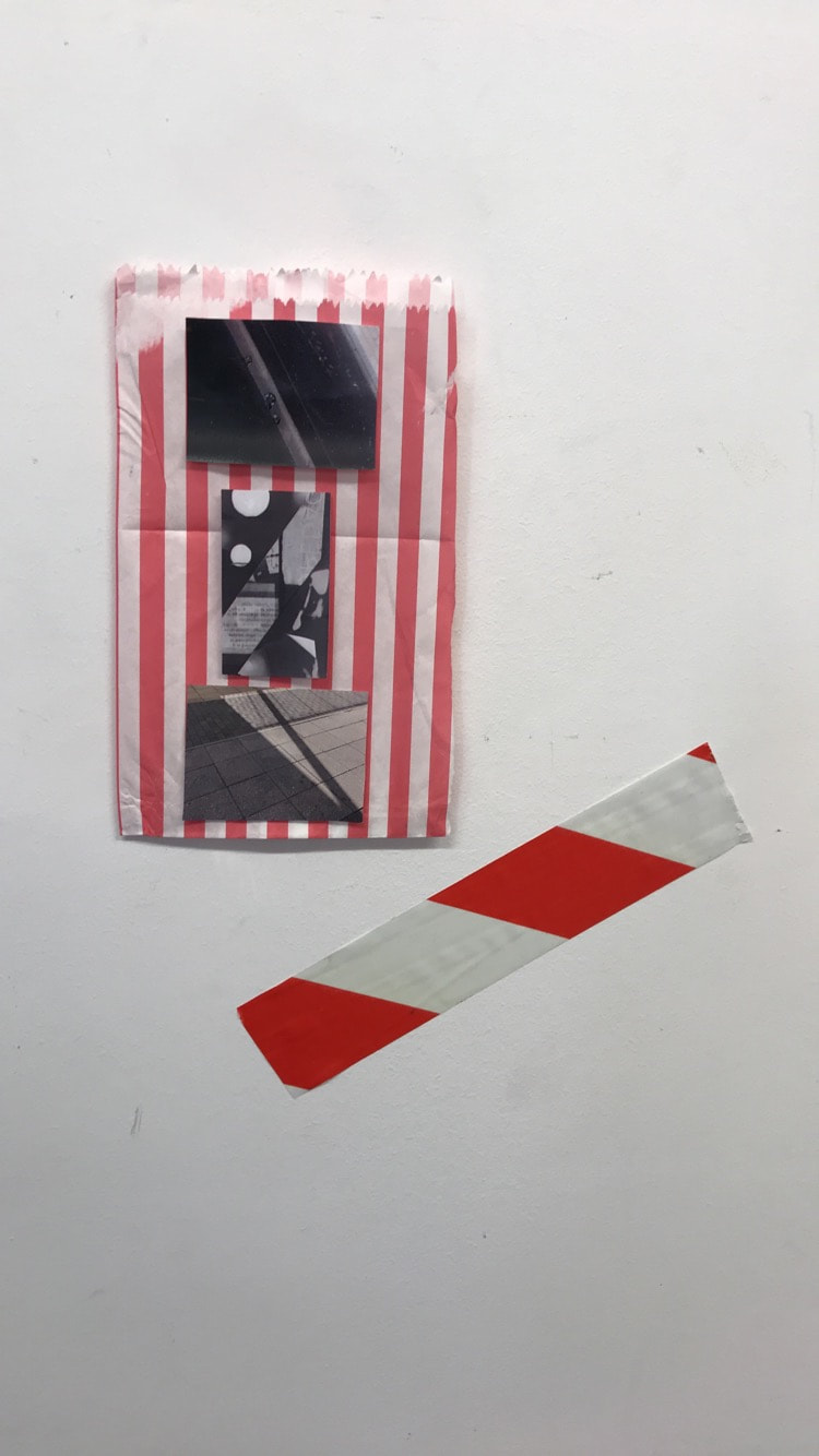
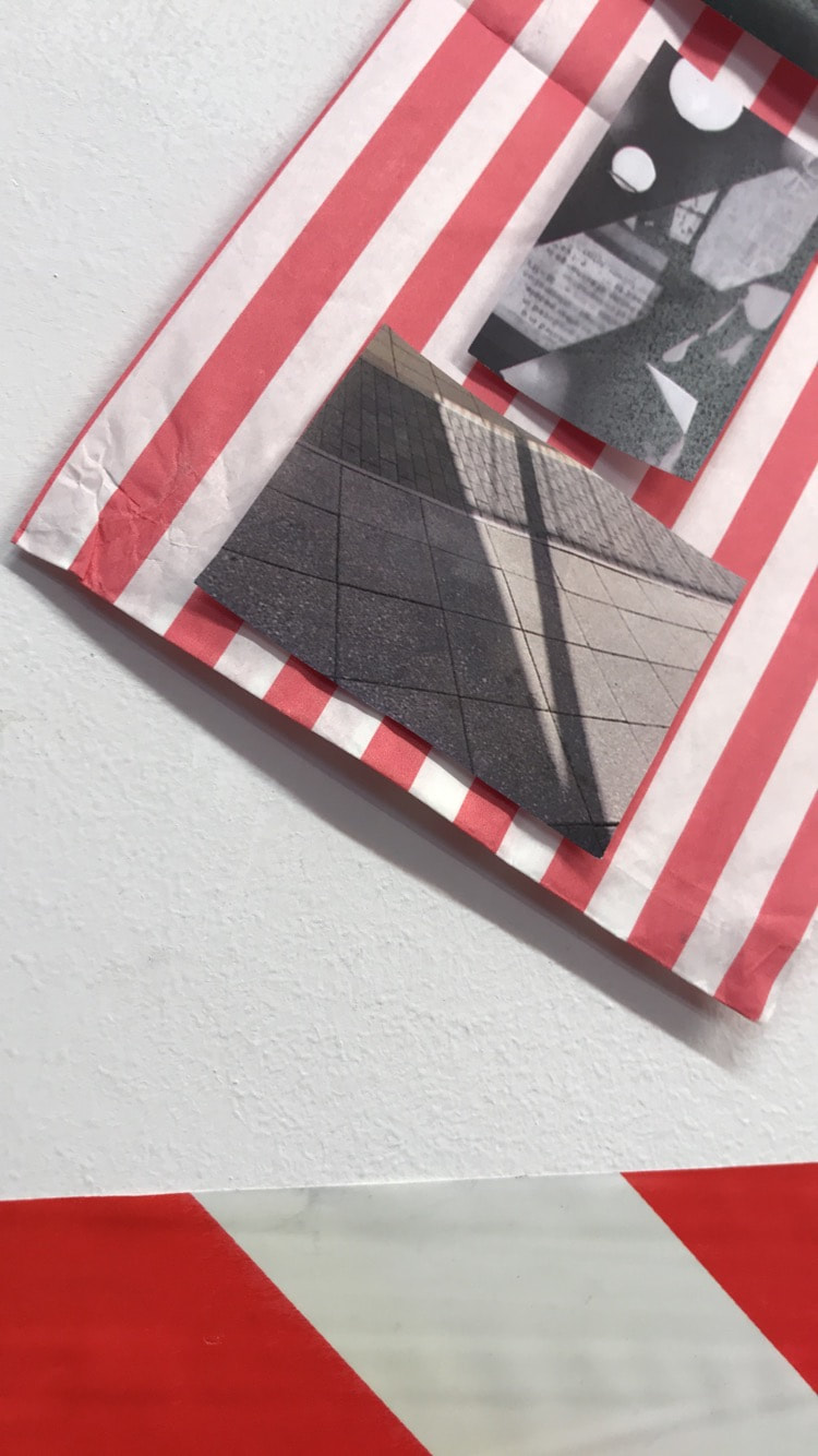
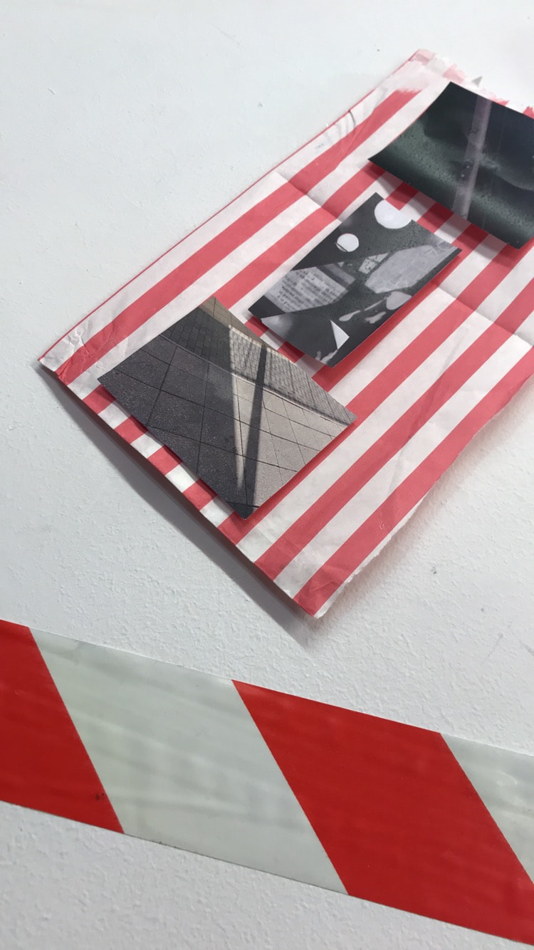
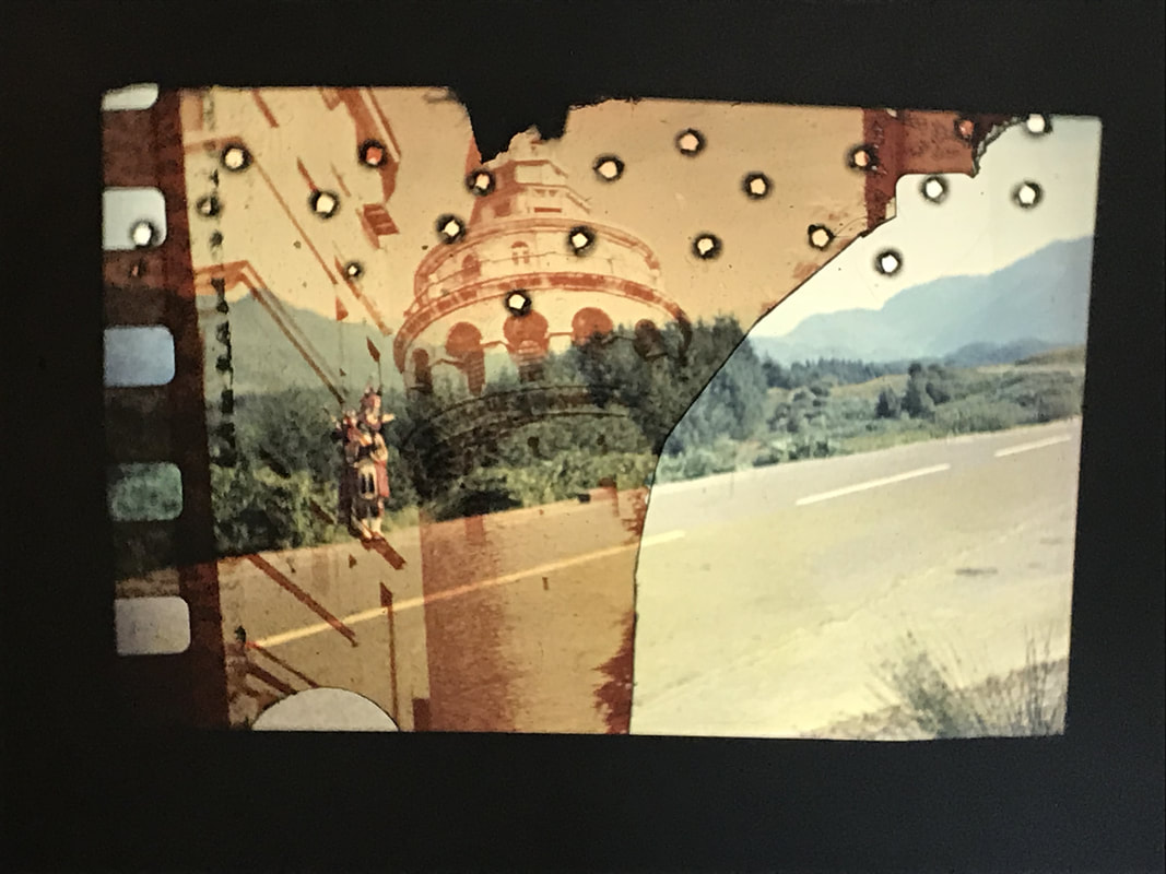
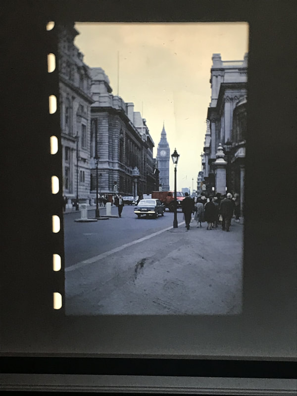
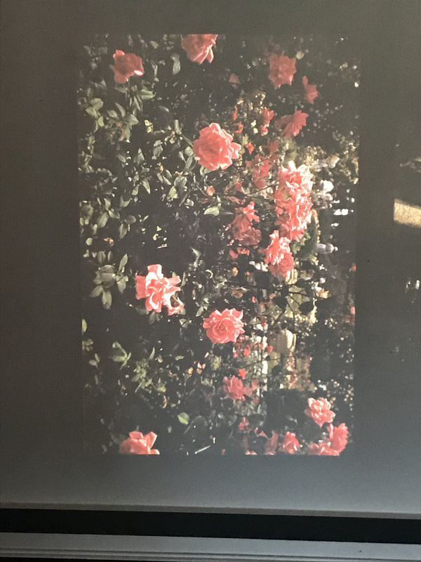
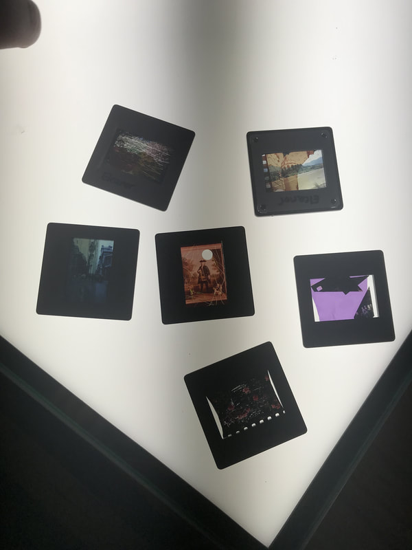
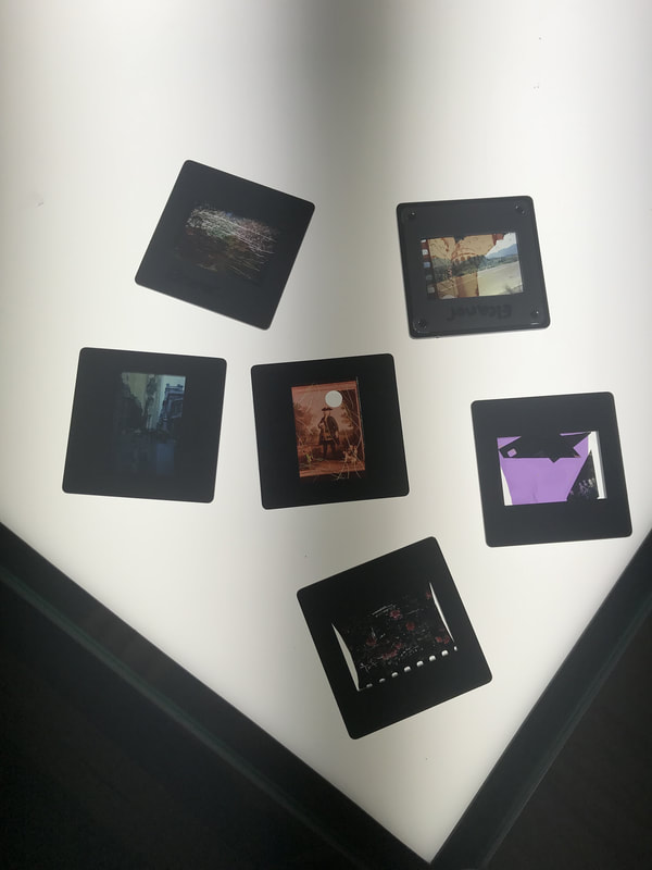
Dafna talmor workshop 2018
some of dafna's work
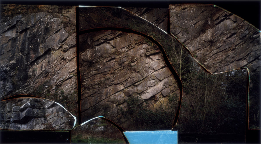
Dafna Talmor is a photographer,born in Israel. She moved to Venezuela when she was 5 then moved again to the uk to go to goldsmiths collage to do a BA in fine arts. While she was at goldsmiths she kept finding herself going back to photography. Dafna always liked photography as she moved around a lot and photographs allowed her to take physical memories with her.
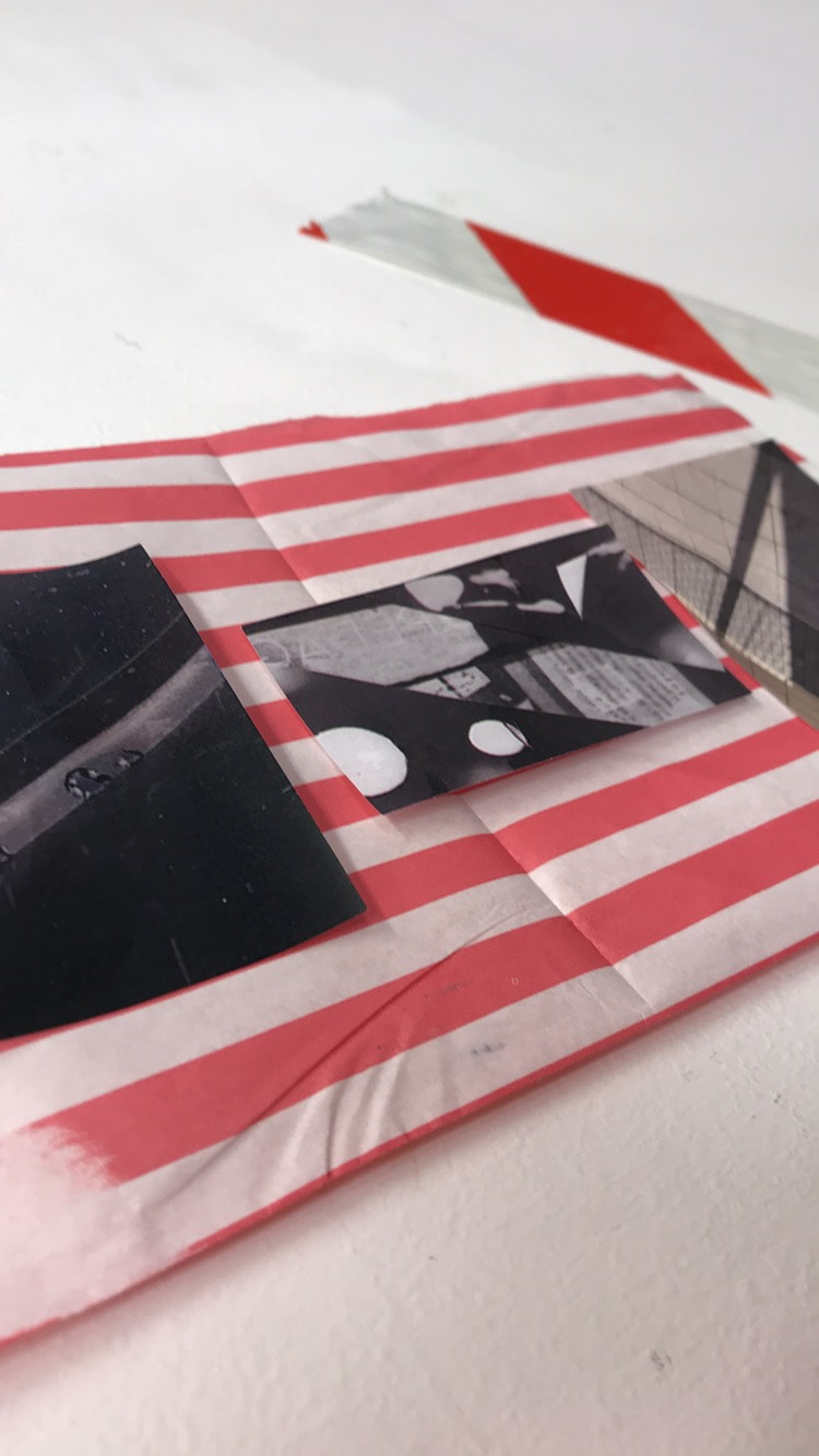
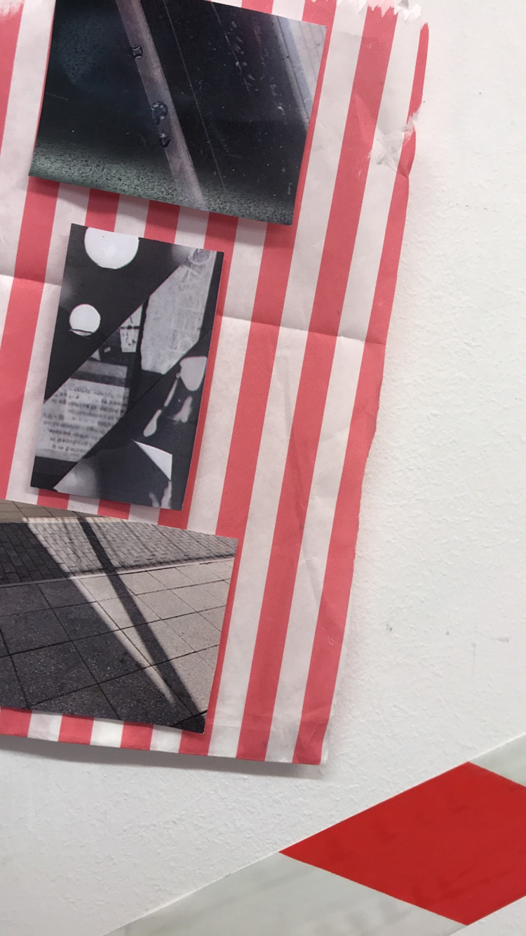
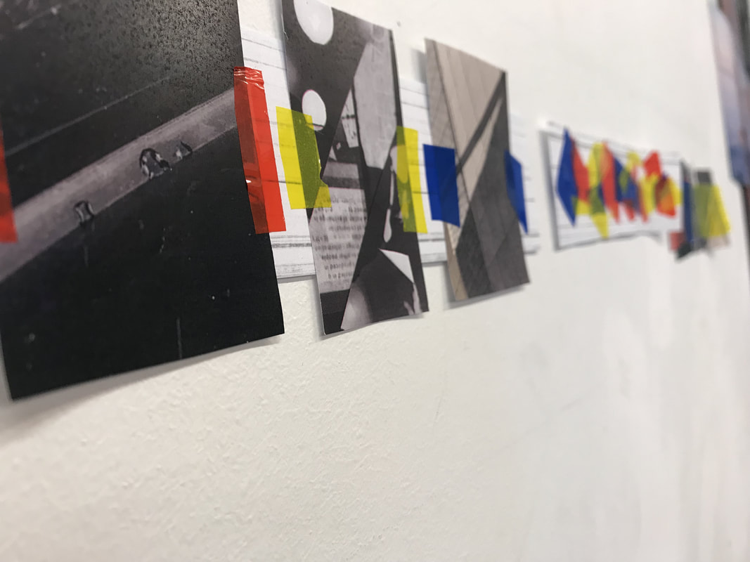
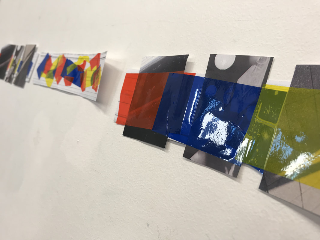
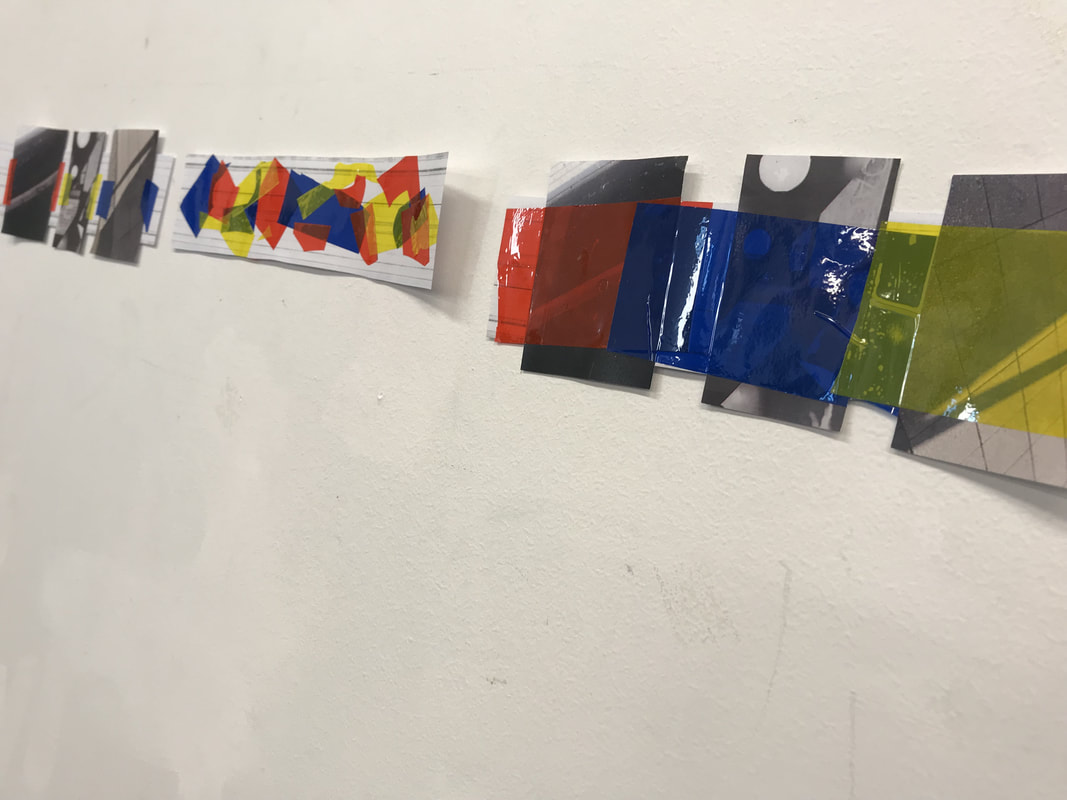
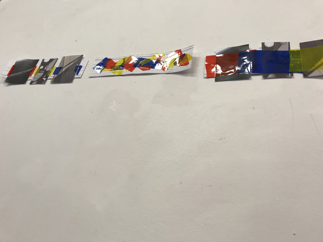
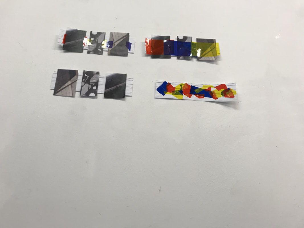
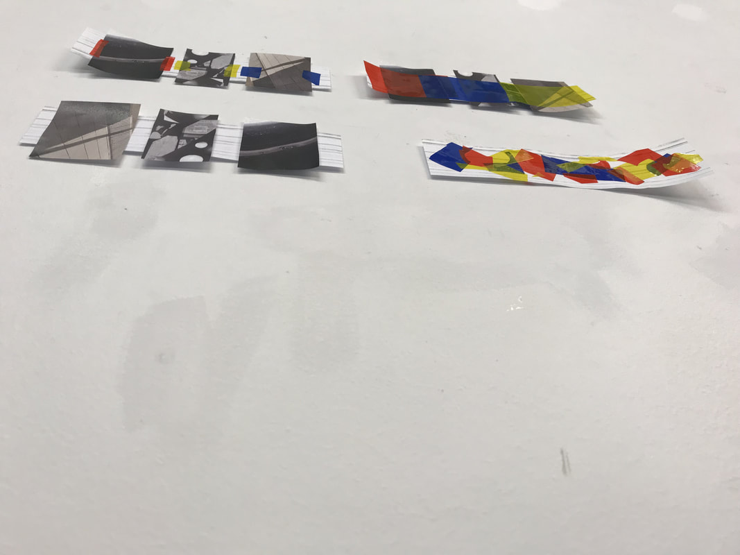
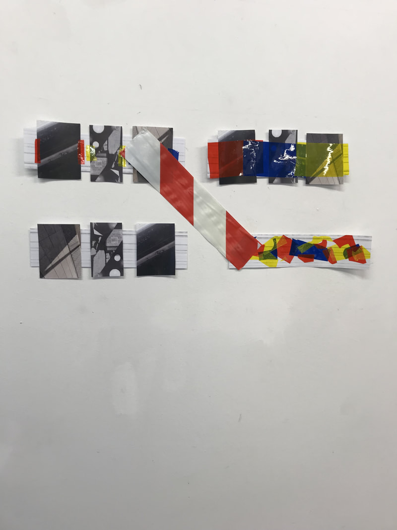
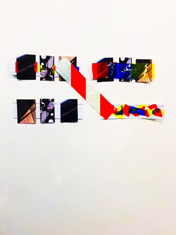
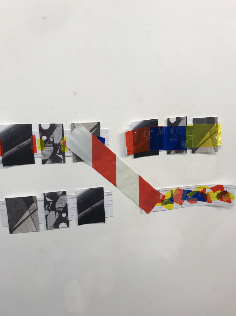
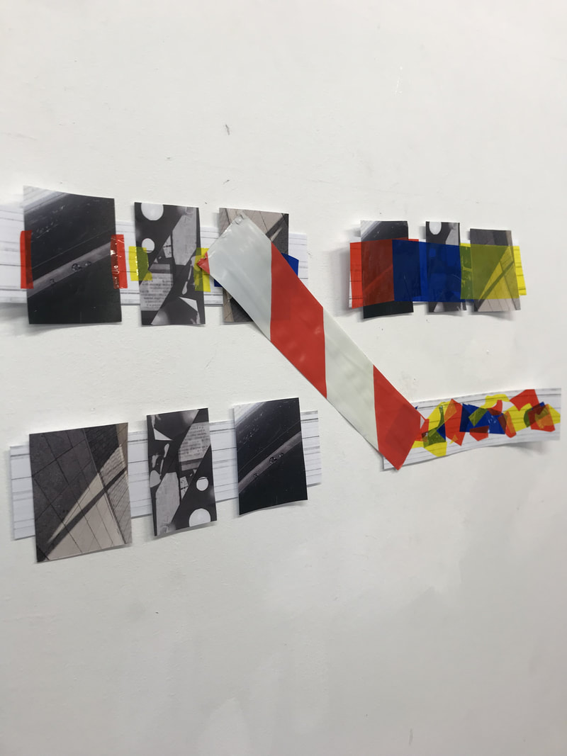
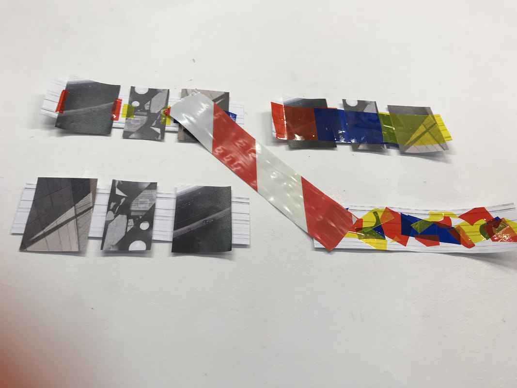
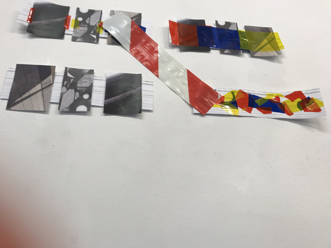
A lot of Dafna's work involves landscapes and not because she enjoys photographing landscapes. Dafna takes photos of landscapes and then cut out manmade things or things she doesn't think work in the photo and then tapes the images back together sometimes sticking multiple images back together making a completely new image.
Dafna's work involves combination printing used a lot in photgraphy history particularly in the 19 th century in pictorialist photographs like in photographs by Gustave le gray. Gustave le gray used combination printing because he photographed landscapes and if he photographed a landscape either the land or the sky would be over or under exposed due to technology and cameras not being very good. He therefore took two separate photos and stuck them together in order to get one photo that did have the right exposure in every area of the photo.
Unlike other photographers Dafna's landscape work is on quite a small scale she also doesn't travel really far away to get a different kind of landscape photo, she makes them different herself by manipulating them and editing them in certain ways. She normally adds of takes away parts of the photo from her negative that she likes or dislikes in order to make a final photo that she is completely happy with much like Gustave le grey did with his images.
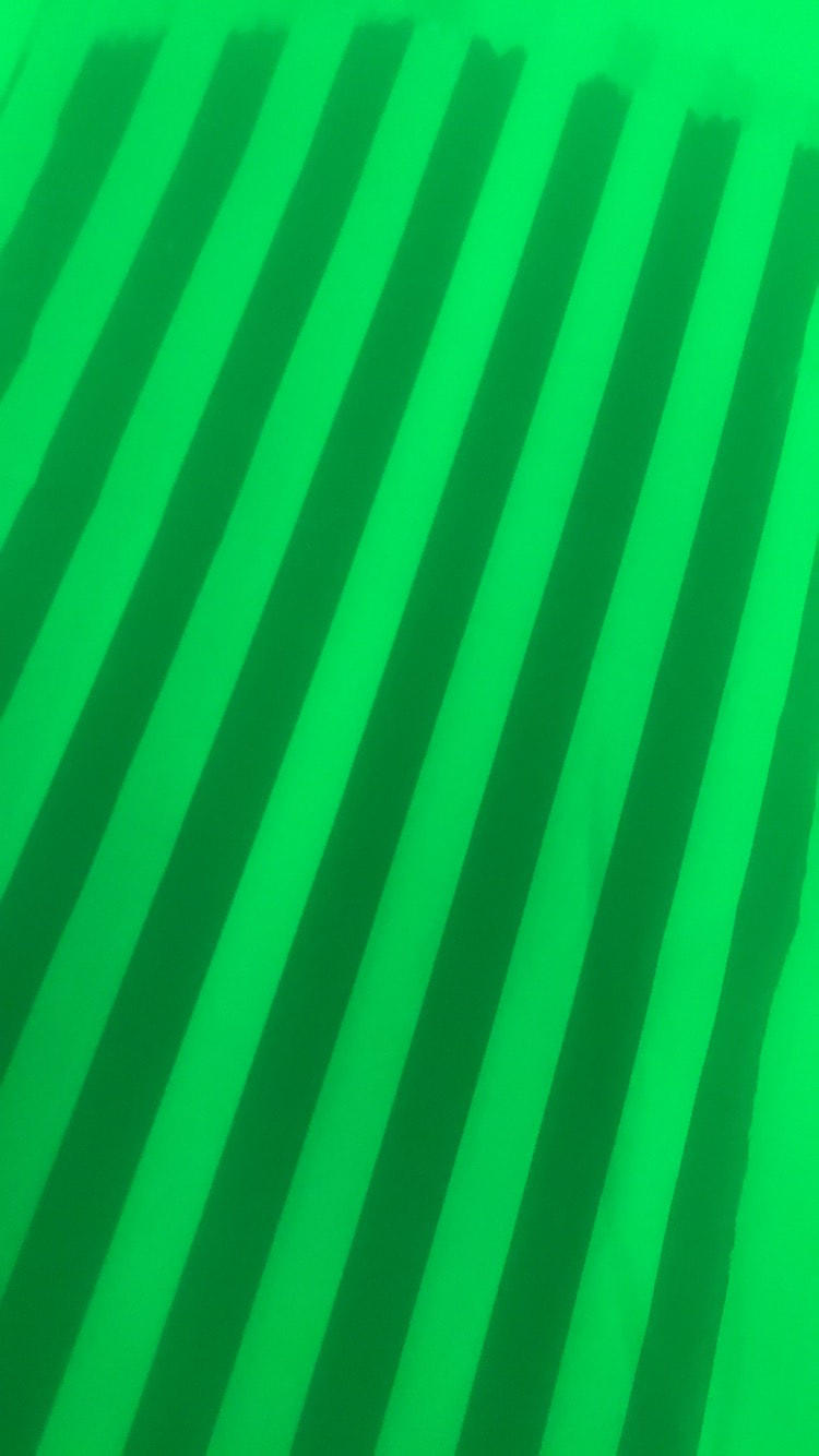
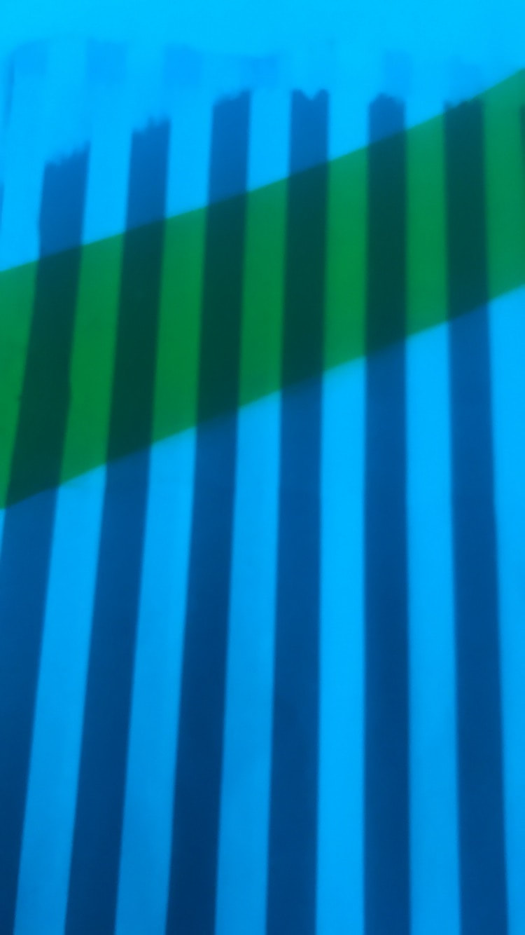
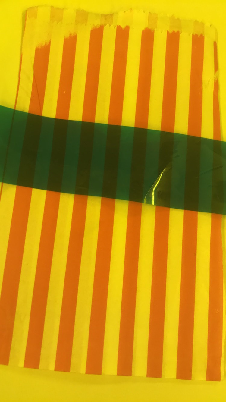
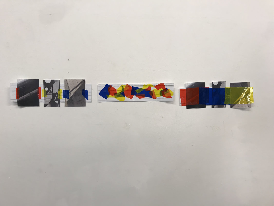
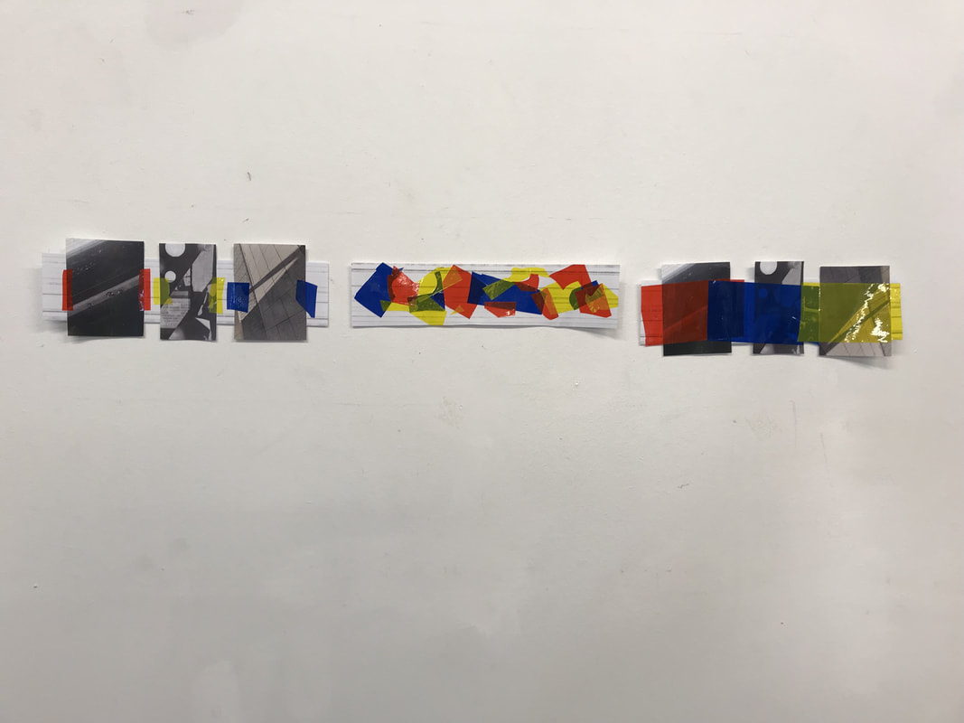
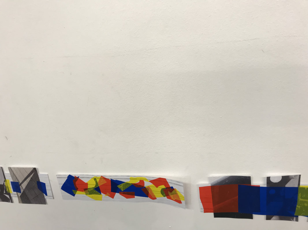
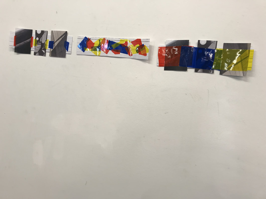
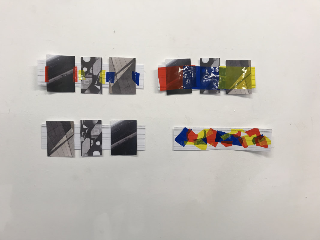
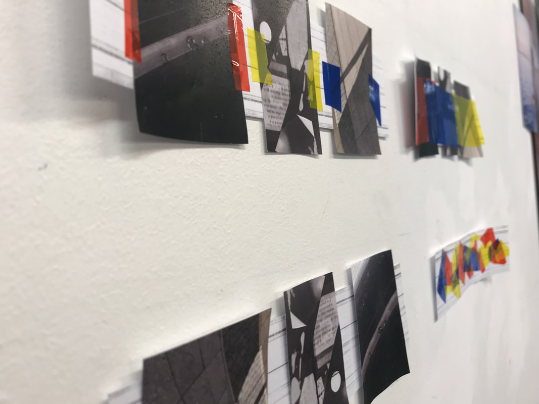
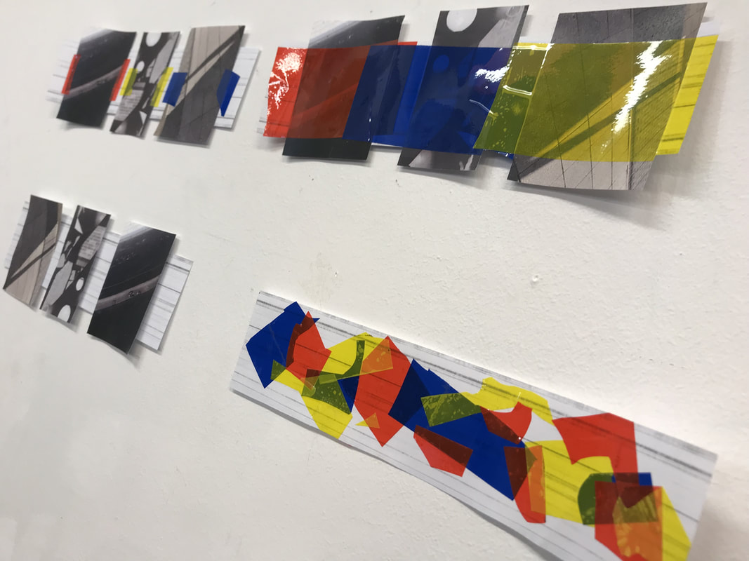
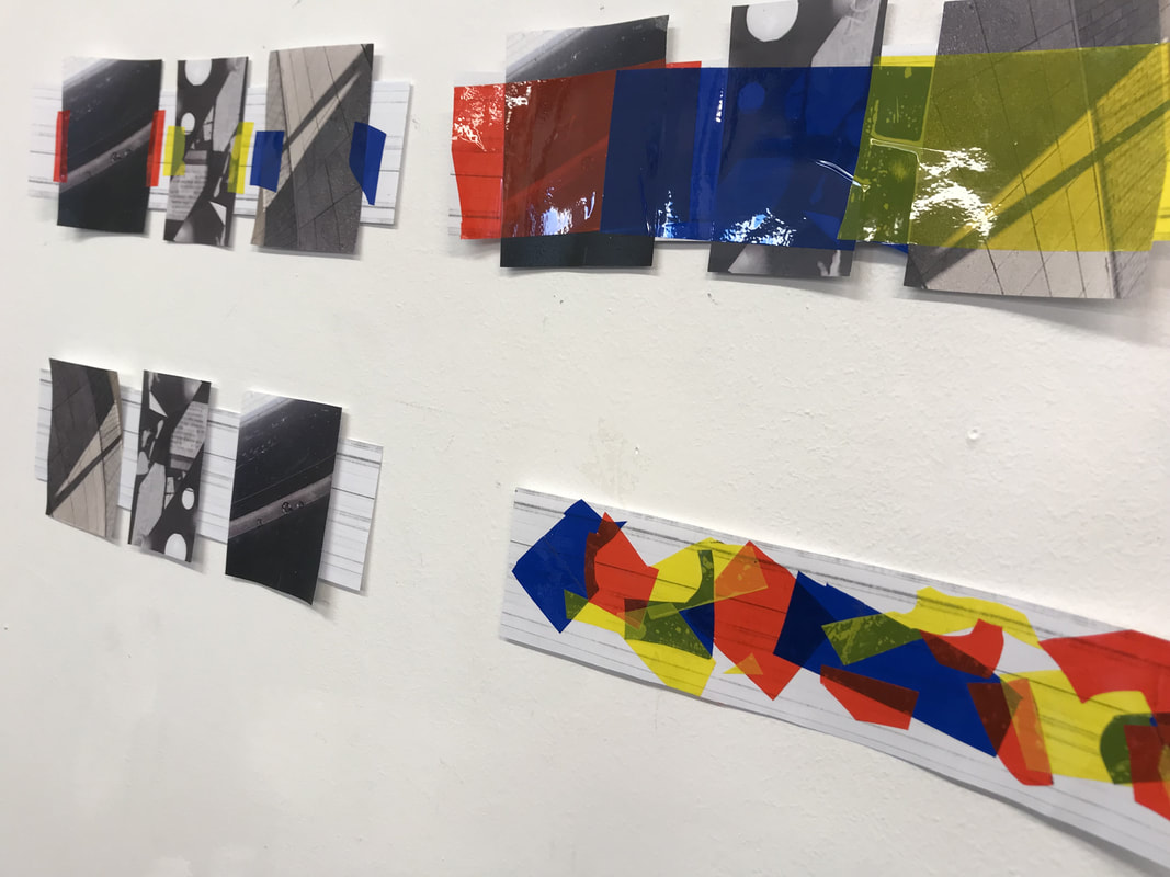
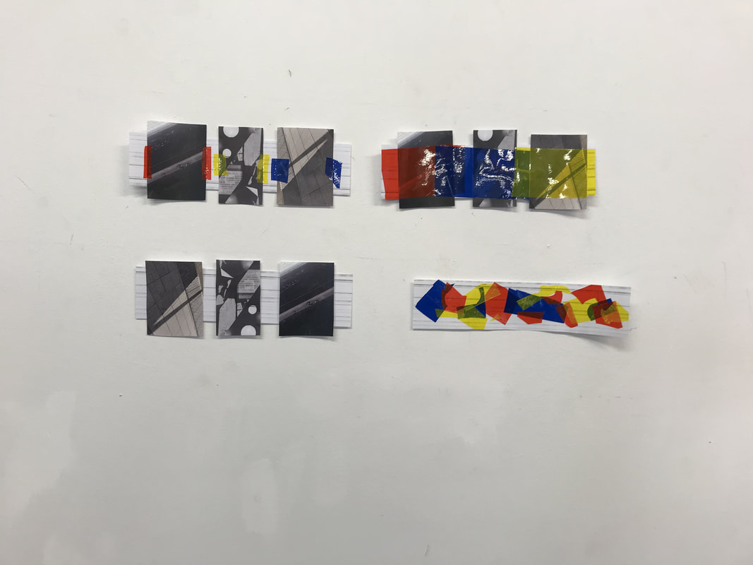
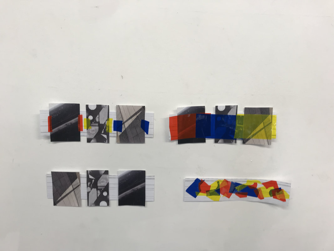
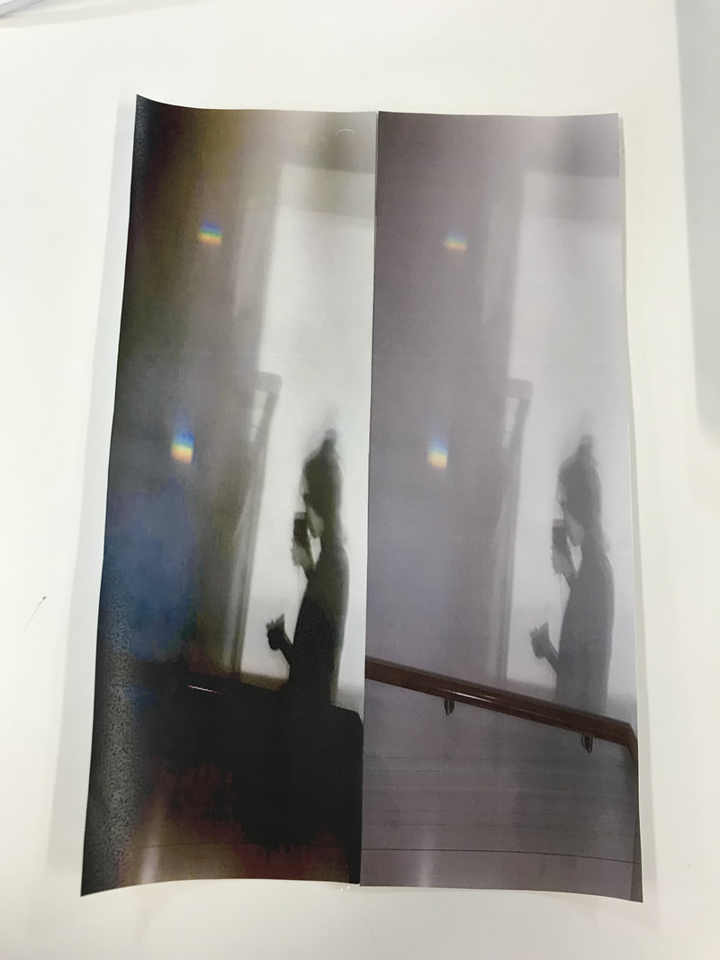
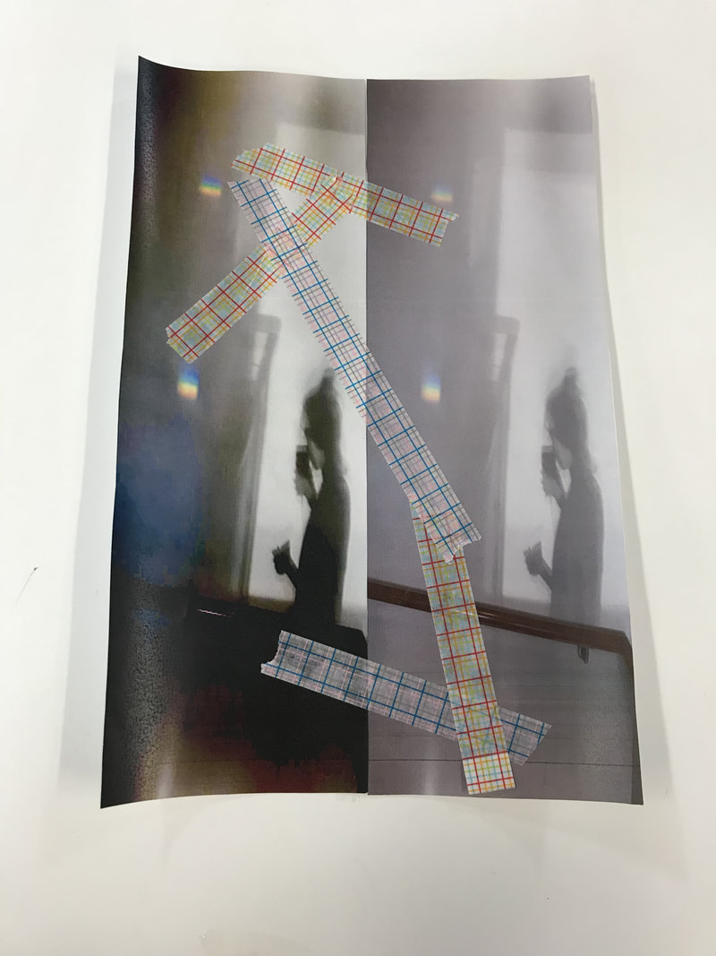
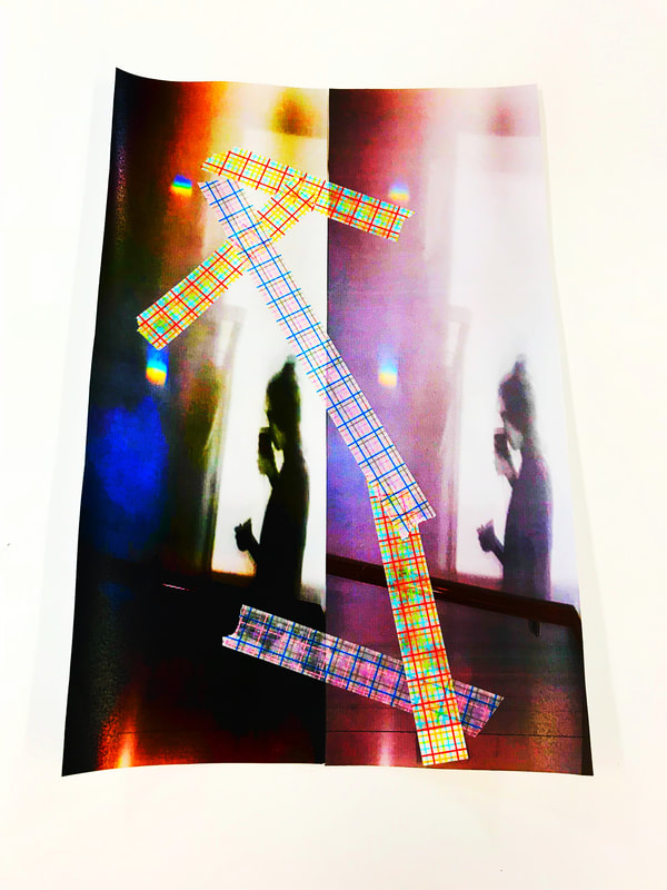
My work throughout the workshop
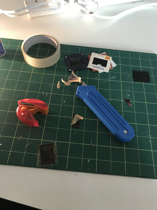
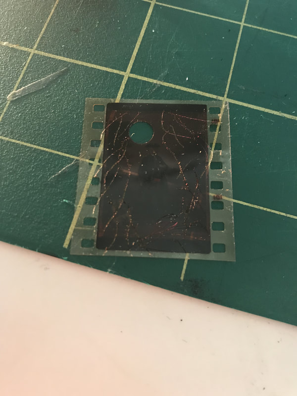
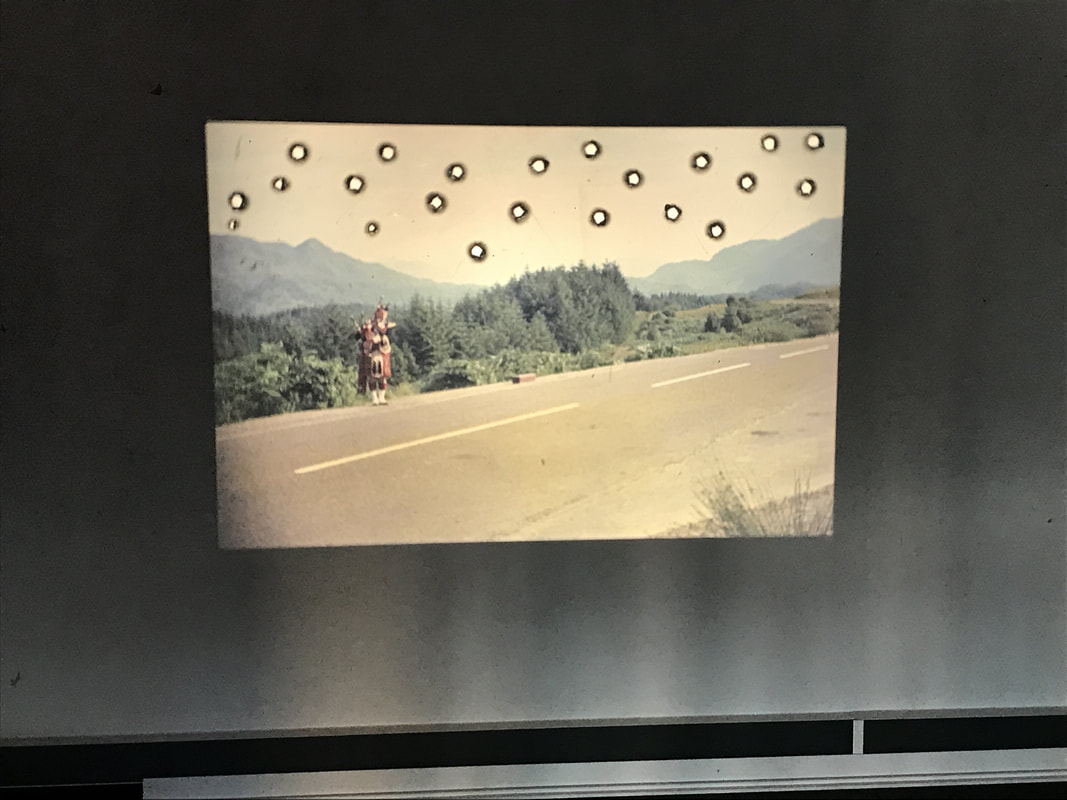
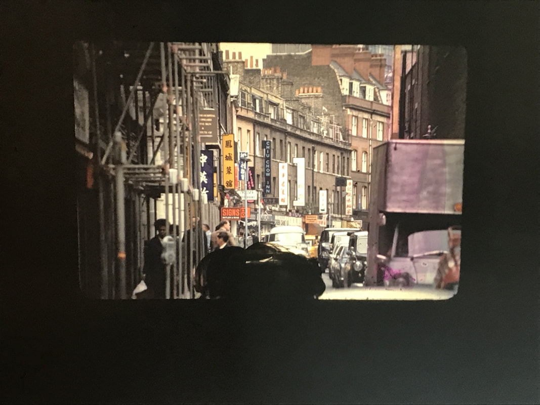
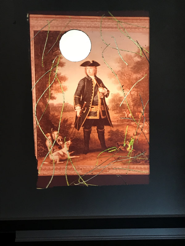
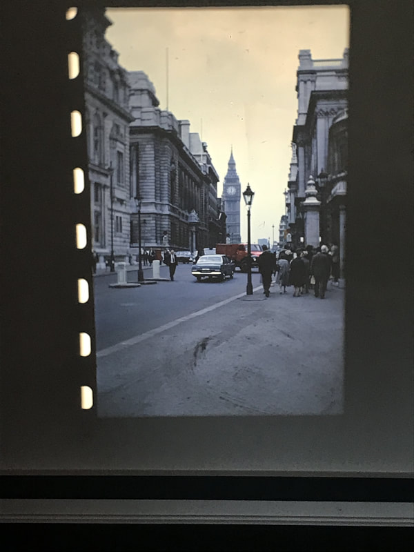
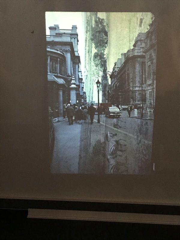
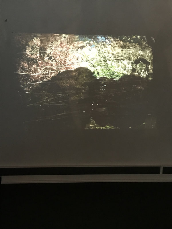
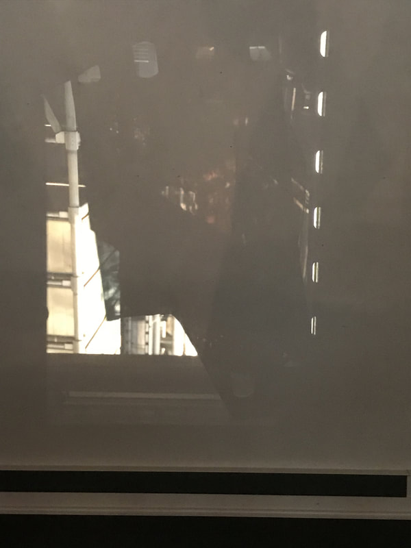
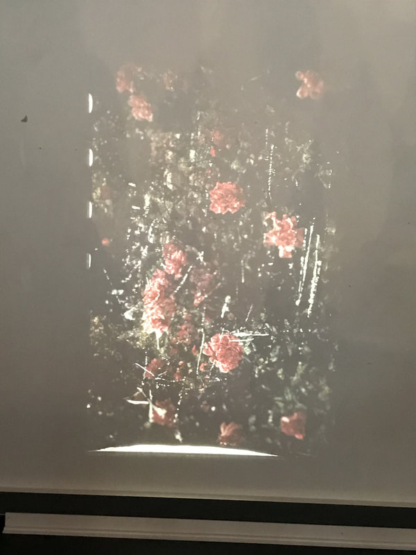

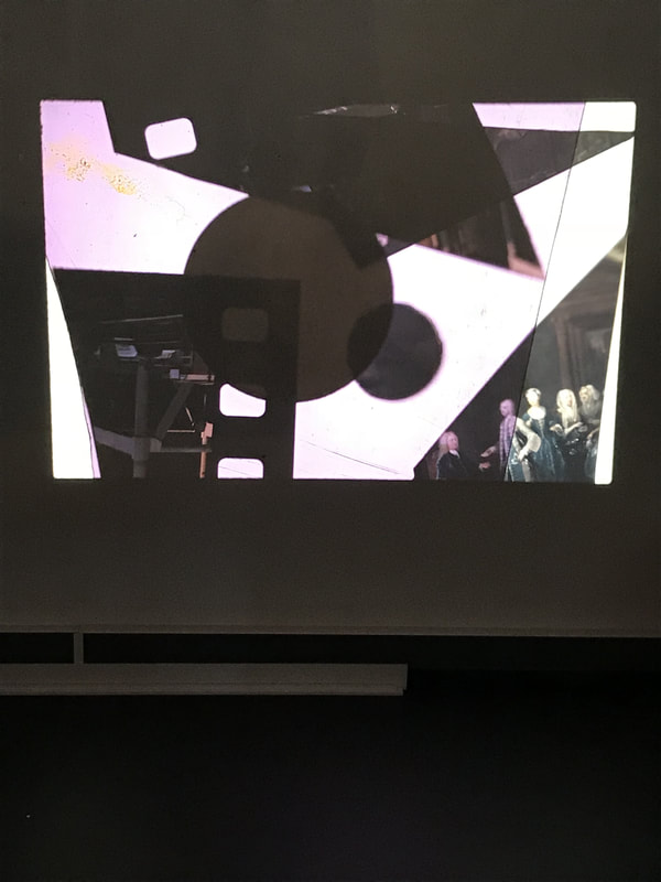
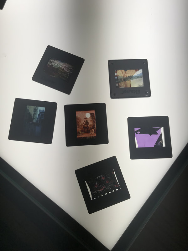
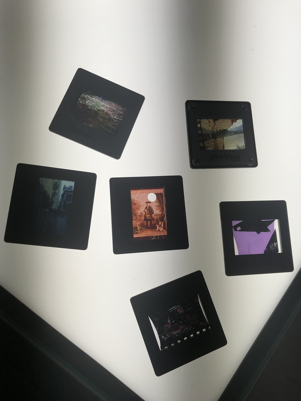
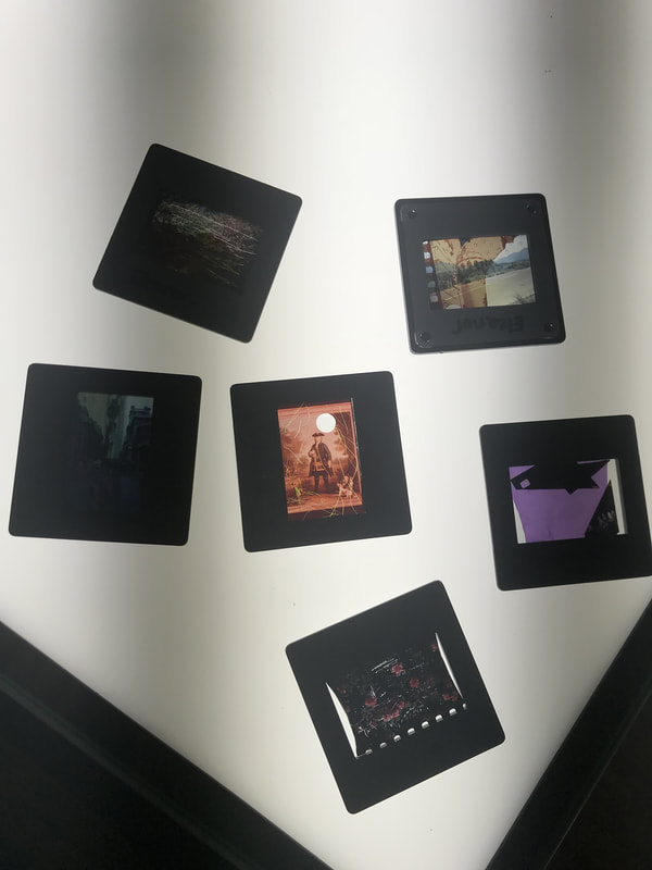
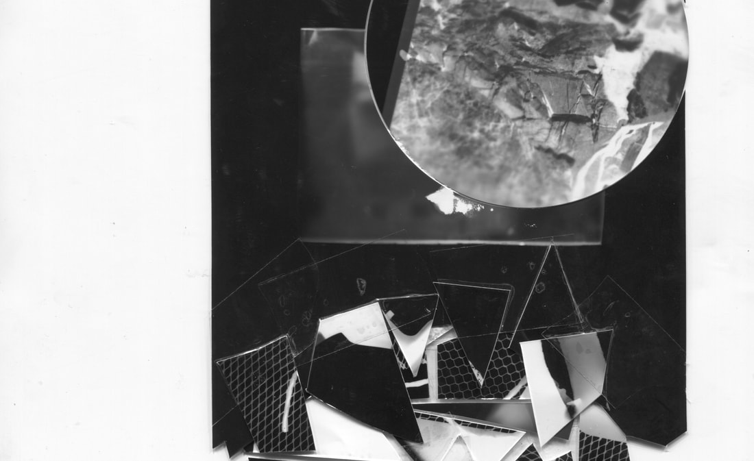
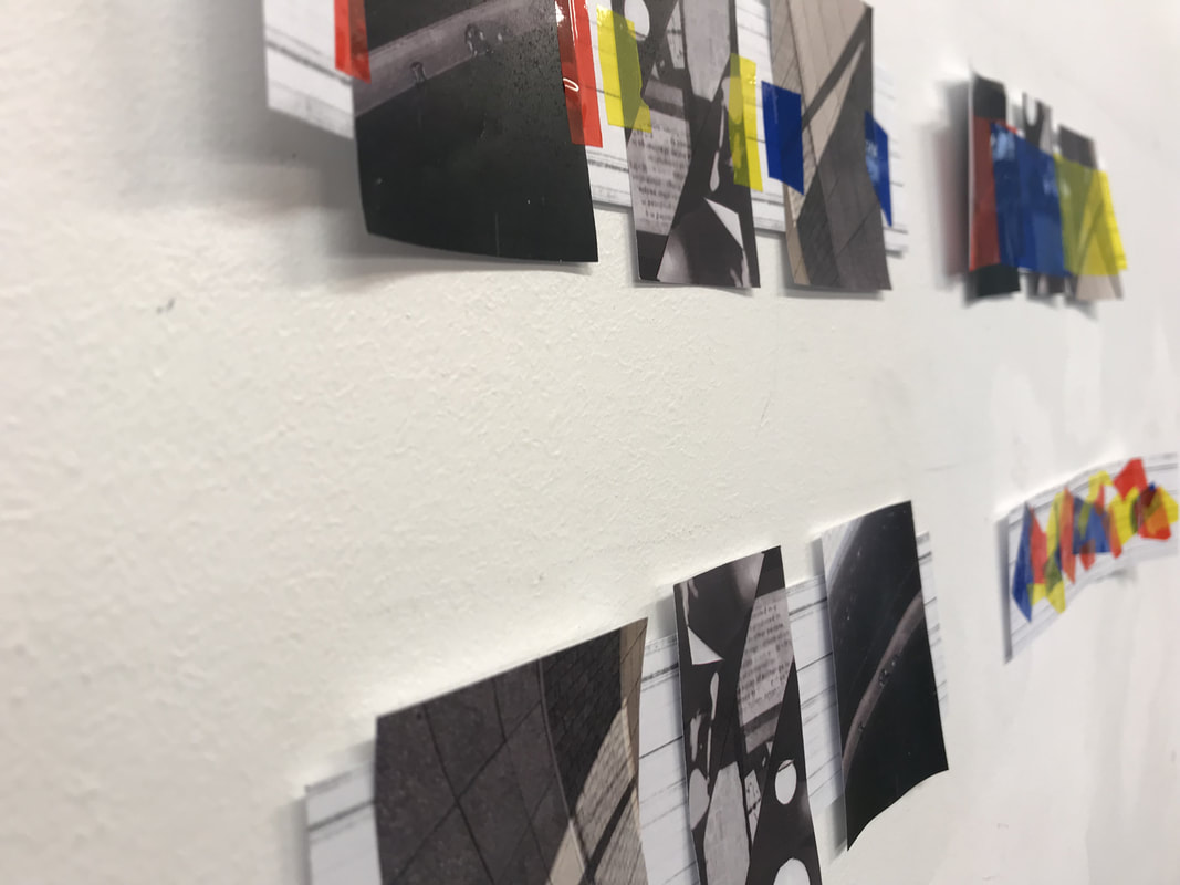
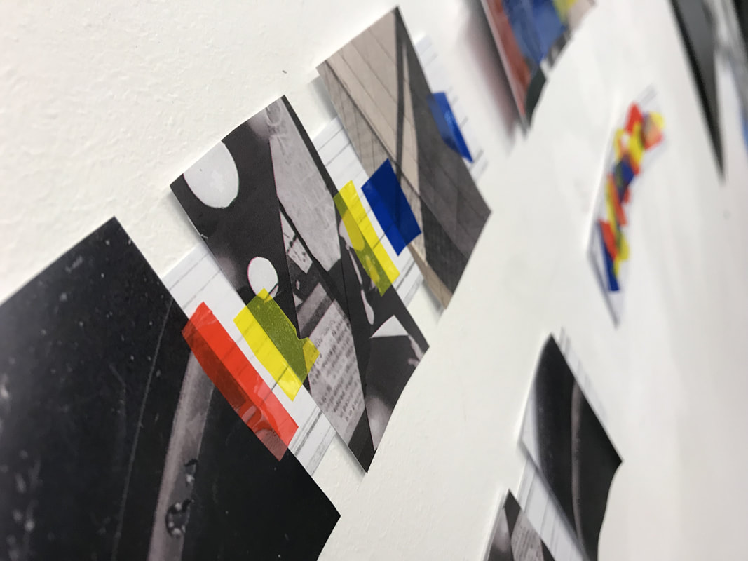
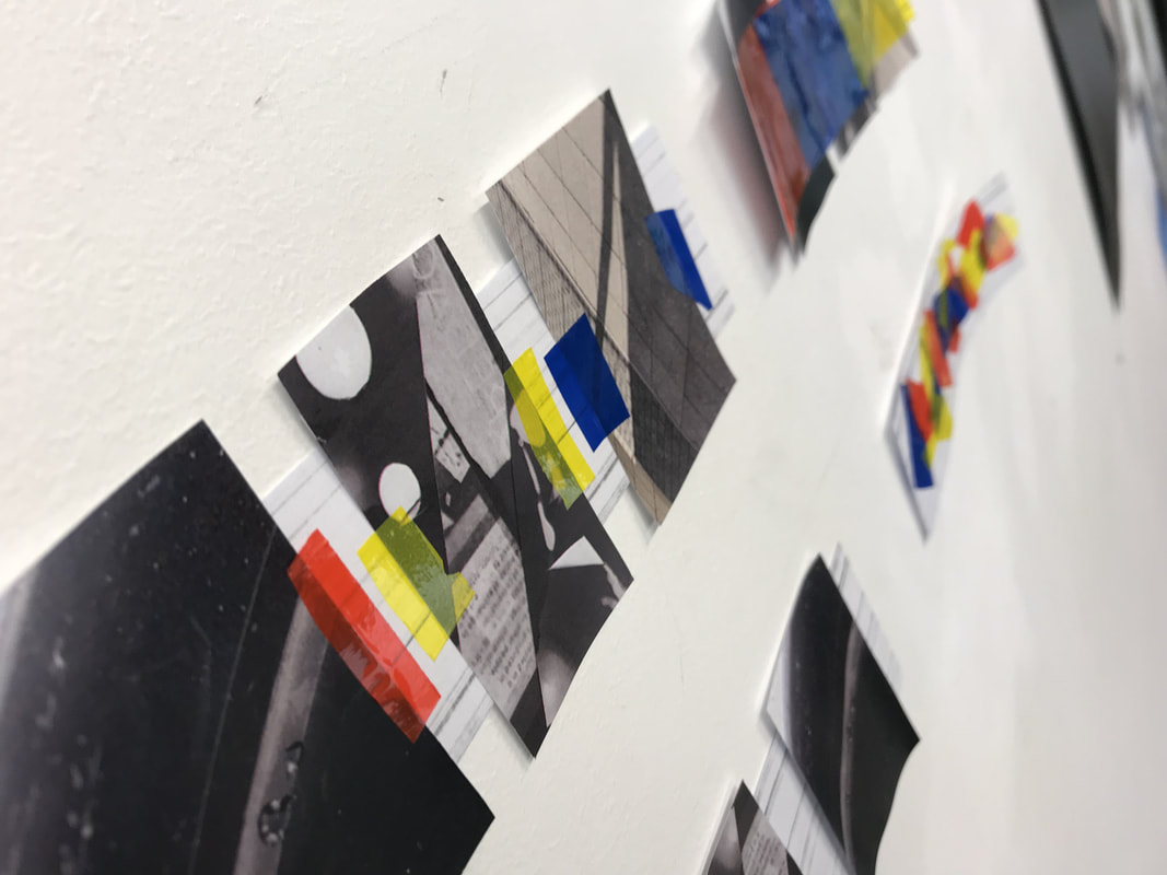
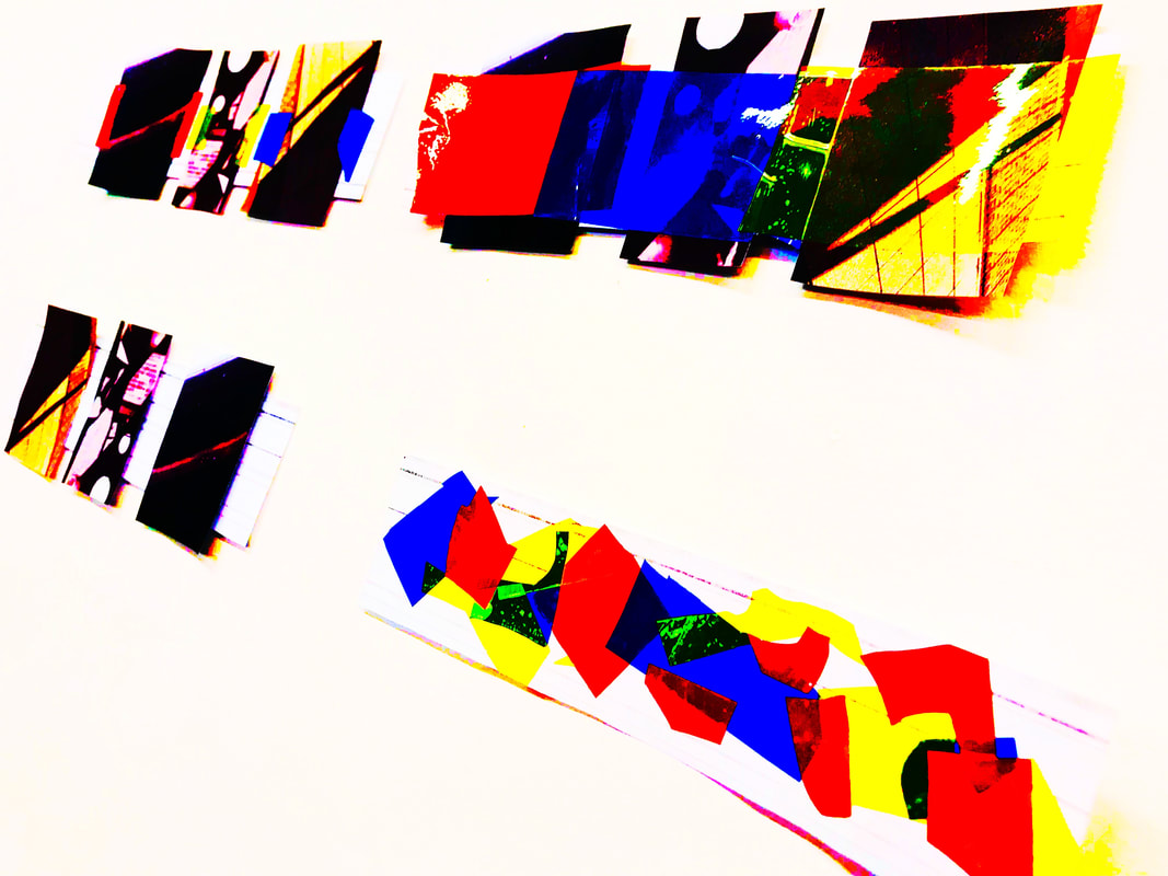
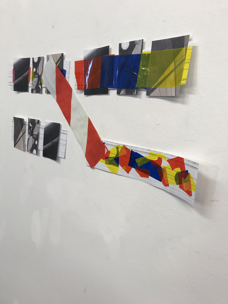
I wanted to create lots of different kind of negatives and try lots of different techniques so I picked some negatives out randomly from the box in class. I then tried scratching bits off the negative with a pin, I cut out some holes from the photo, I tried putting the negatives in nail varnish remover to try to remove some of the photo but this didn't work very well. I also tried adding colour through paint and highlighting and then simple overlaying different negatives together. With all the leftover pieces I also tried making a completely new negative with several different pieces of negatives.
evaluation of my images
WWW- I experimented with putting different colours in my negatives and incorporating lots of different shapes in my negatives and I also used a variety of different images.
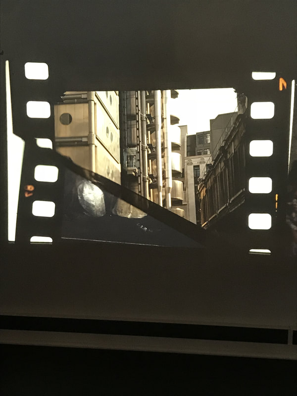
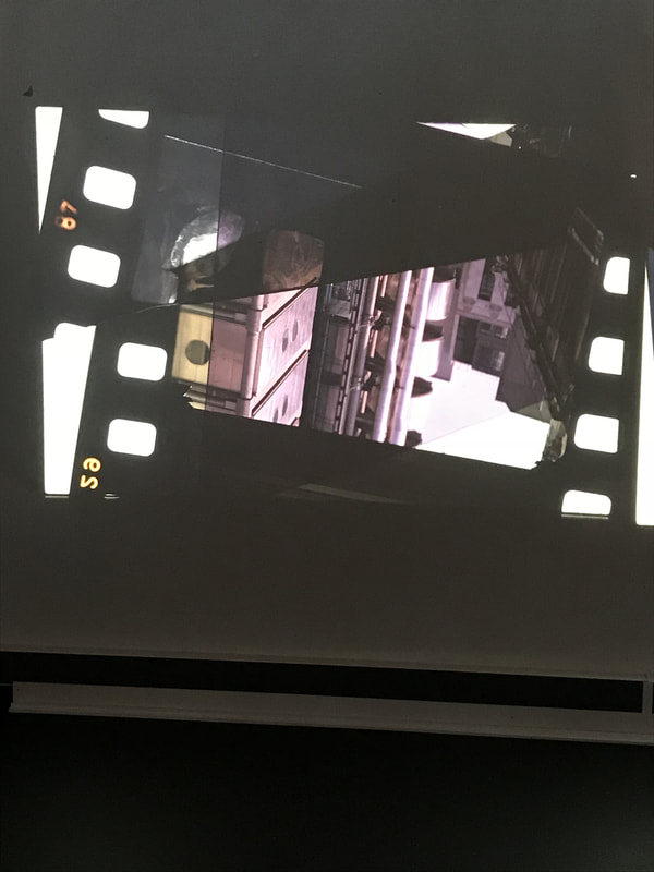
EBI-I made each of the photo's look more connected and like they were taken in the same place. Also if I tried putting my negatives over one another in the projector so there was one image from multiple different images.
Next time I will try experiment with projecting images over each other and creating a new images out of 2 already remade images so I will end up having more final outcomes from the same 2 negative. I also might try photographing my negatives from the projector with coloured translucent paper so it looks like the negatives are different colours when they're actually not.
This workshop definitely has changed how I look to photograph things in the future as I became more comfortable with the projector I definitely think I will use the projector with some of my images for lots of different projects.
photos
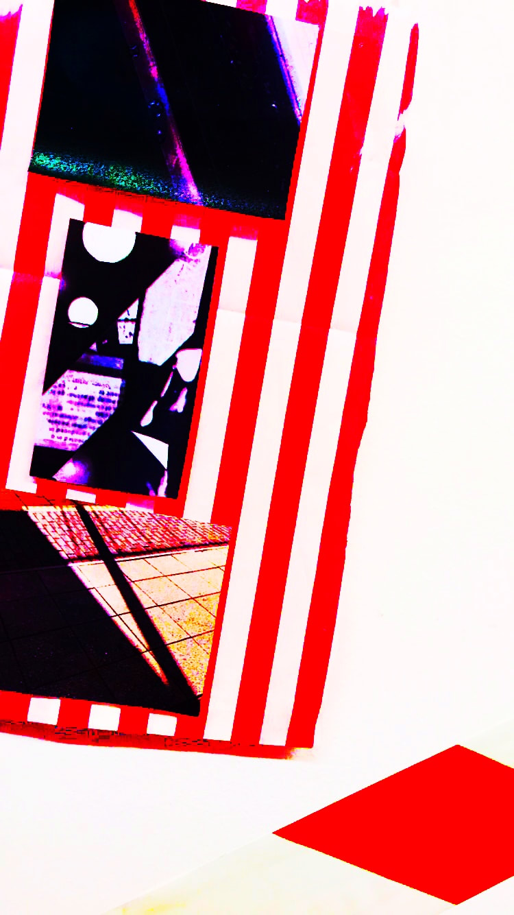
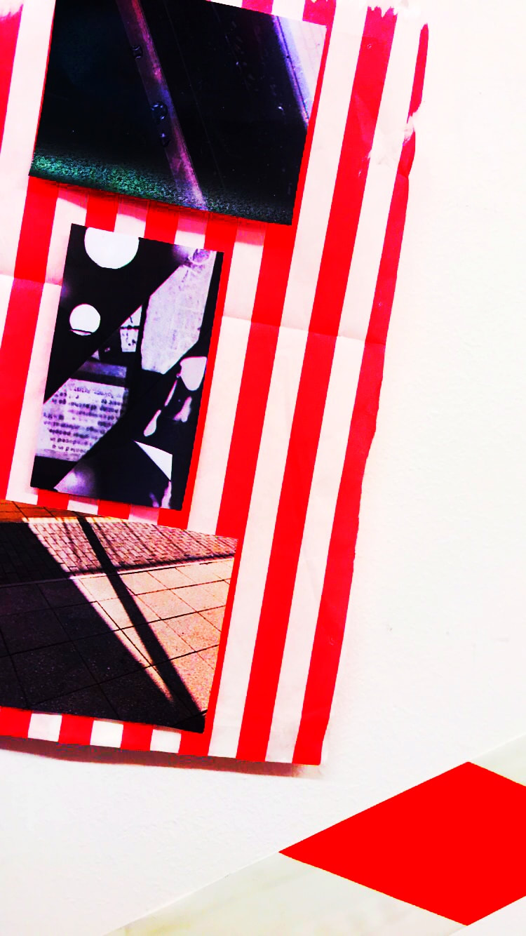
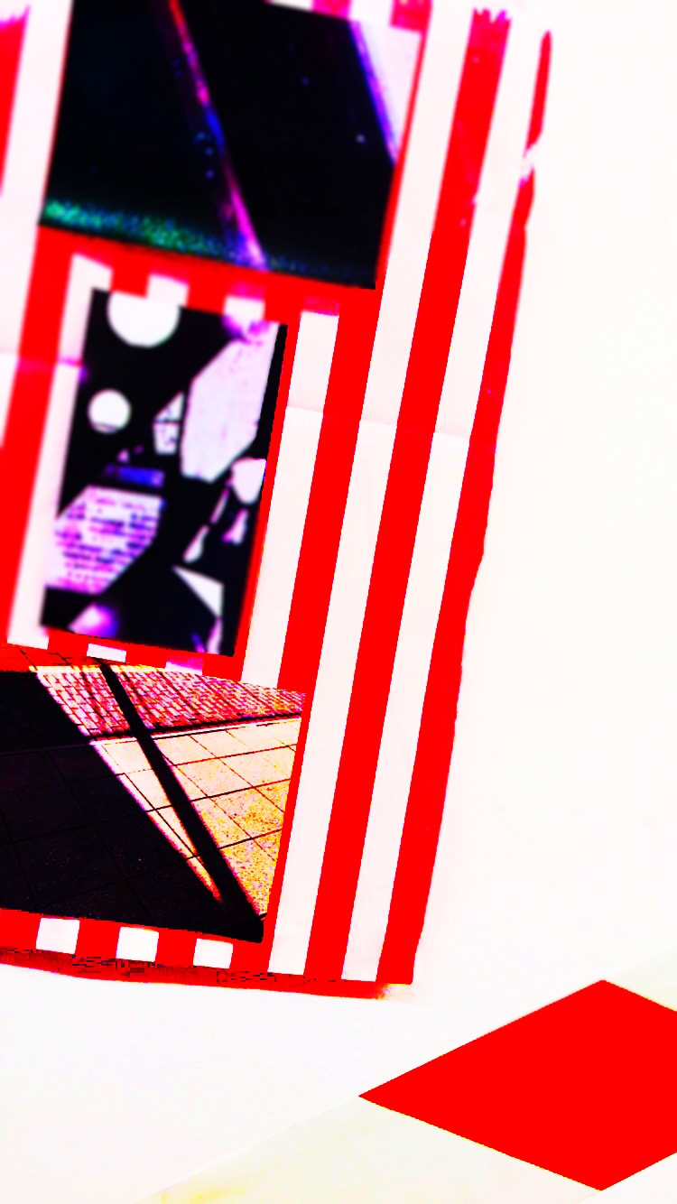
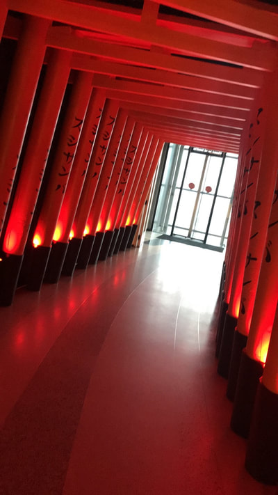
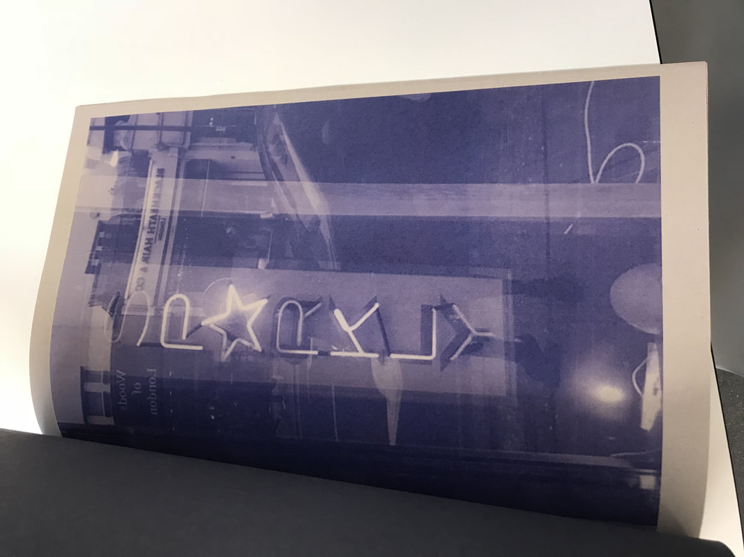
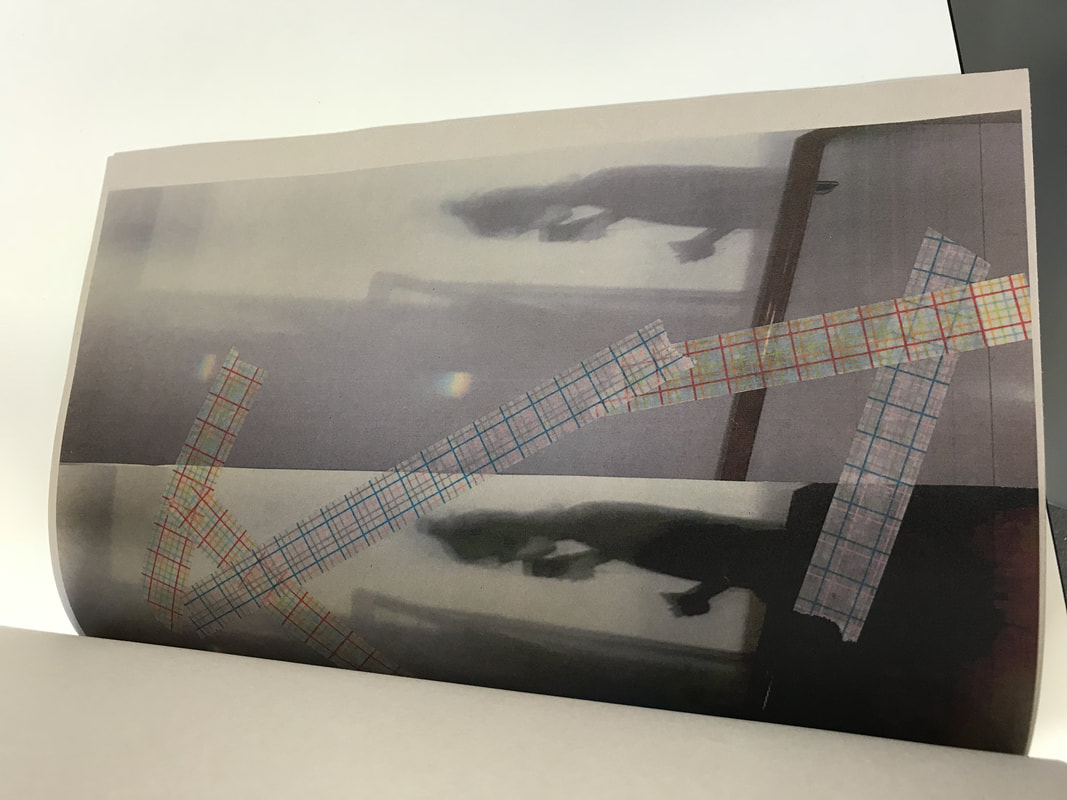
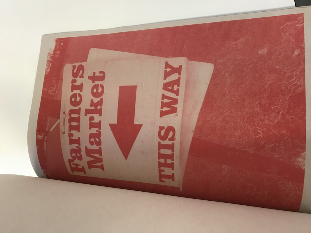
Abstraction book

Abstract book evaluation (FINAL OUTCOME)
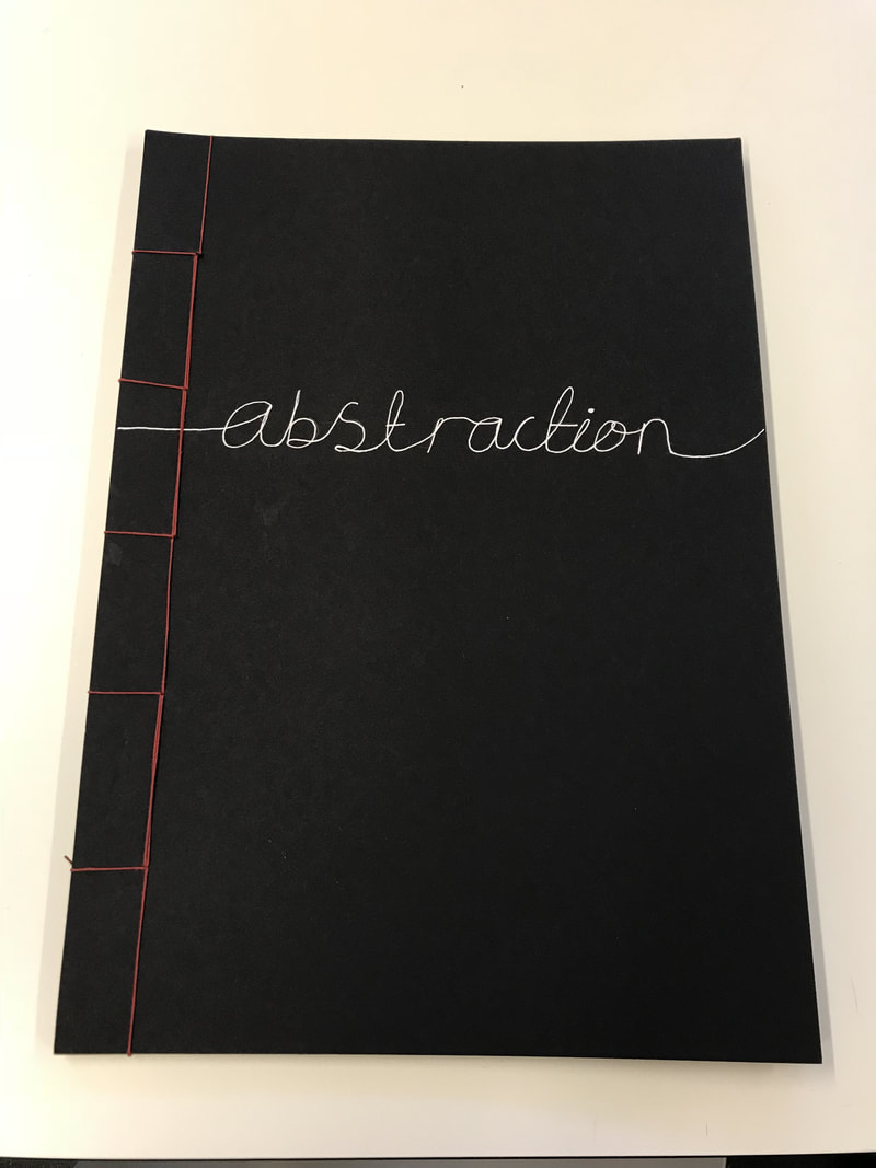
I chose to make a book of my different abstract photos as I thought it would be easy for lots of different audiences to look at. I also thought having a book would allow me to present my different photoshoots on different pages and present them in lots of different ways having one page dedicated to a certain photoshoot of a certain thing. When I had made all the pages in my book I decided I wanted to make the front of my book look a little bit different so I chose to use a technique called Japanese binding, Japanese binding is a way of binding a book together .There are lots of different designs and colours you could use but I wanted to use quite a simple pattern because I thought it would look best with my book and I also chose to use red because I thought the colour red would go quite well with the black front cover of my photo book. Some people who inspired me to make a photo book for my final outcome were Brandon Woelfel and Vivian Maier as they have both made phonebooks of there work and while looking at there books I thought it worked really well. Overall I really like my photo book as Think all the colours, editing techniques and photographs work really well together .Now I'm going to make new images photographing my book in different places that are interesting or relate to the photo book so I kind of have another outcome of my final outcome. One thing I do think I could improve about my book is by binding it a little bit further to the edge or at the top so my book would be easier to open and read through.
